WINNERS GALLERY

Sun Rising Seosan
• A brand mark that embodies the dynamic and vibrant future of Seosan, evoking the image of a rising sun, a pristine sea, and majestic mountains
• The image of Seosan, where the “S” represents the city’s unique character and the “person” symbolizes the happiness of its citizens, is a true representation of a citizen-centered Seosan
• The image of the rising sun is transformed into a wave-like shape, symbolizing Seosan’s growth into a thriving logistics hub on the west coast, opening up new shipping routes
• Seosan, a city that rises to become a cutting-edge industrial city, is represented as a city where the sun rises
• The seven-unit sculpture represents Seosan, a city blessed with good fortune
• The central English letter “S” represents Seosan’s global expansion and reach
• The English name “CA: Creative & Active” embodies the dynamic spirit of Seosan, where creative ideas are brought to life through action
 https://nyfknba.com/wp-content/uploads/2026/04/homepage_CU-7-1.jpg
1889
1417
nyfknba
https://nyfknba.com/wp-content/uploads/2025/11/nyf_logo1.svg
nyfknba2026-04-08 14:06:472026-04-08 14:06:47SEOUL METROPOLITAN OPERA
https://nyfknba.com/wp-content/uploads/2026/04/homepage_CU-7-1.jpg
1889
1417
nyfknba
https://nyfknba.com/wp-content/uploads/2025/11/nyf_logo1.svg
nyfknba2026-04-08 14:06:472026-04-08 14:06:47SEOUL METROPOLITAN OPERA https://nyfknba.com/wp-content/uploads/2026/04/homepage_CU-6-1.jpg
1889
1417
nyfknba
https://nyfknba.com/wp-content/uploads/2025/11/nyf_logo1.svg
nyfknba2026-04-08 14:04:402026-04-08 14:04:40DANNY JUNG (Contemporary Jazz Artist)
https://nyfknba.com/wp-content/uploads/2026/04/homepage_CU-6-1.jpg
1889
1417
nyfknba
https://nyfknba.com/wp-content/uploads/2025/11/nyf_logo1.svg
nyfknba2026-04-08 14:04:402026-04-08 14:04:40DANNY JUNG (Contemporary Jazz Artist) https://nyfknba.com/wp-content/uploads/2026/04/homepage_CU-5-1.jpg
1889
1417
nyfknba
https://nyfknba.com/wp-content/uploads/2025/11/nyf_logo1.svg
nyfknba2026-04-08 14:00:592026-04-08 14:00:59SAEKYUNG RIM (Opera Singer)
https://nyfknba.com/wp-content/uploads/2026/04/homepage_CU-5-1.jpg
1889
1417
nyfknba
https://nyfknba.com/wp-content/uploads/2025/11/nyf_logo1.svg
nyfknba2026-04-08 14:00:592026-04-08 14:00:59SAEKYUNG RIM (Opera Singer) https://nyfknba.com/wp-content/uploads/2026/04/homepage_CU-4-1.jpg
1889
1417
nyfknba
https://nyfknba.com/wp-content/uploads/2025/11/nyf_logo1.svg
nyfknba2026-04-08 13:59:532026-04-08 13:59:53JUNMO YANG (Opera Singer)
https://nyfknba.com/wp-content/uploads/2026/04/homepage_CU-4-1.jpg
1889
1417
nyfknba
https://nyfknba.com/wp-content/uploads/2025/11/nyf_logo1.svg
nyfknba2026-04-08 13:59:532026-04-08 13:59:53JUNMO YANG (Opera Singer) https://nyfknba.com/wp-content/uploads/2026/04/homepage_CU-3-1.jpg
1889
1417
nyfknba
https://nyfknba.com/wp-content/uploads/2025/11/nyf_logo1.svg
nyfknba2026-04-08 13:58:402026-04-08 13:58:40WHAJA KANG (Chairman of the Beseto Opera)
https://nyfknba.com/wp-content/uploads/2026/04/homepage_CU-3-1.jpg
1889
1417
nyfknba
https://nyfknba.com/wp-content/uploads/2025/11/nyf_logo1.svg
nyfknba2026-04-08 13:58:402026-04-08 13:58:40WHAJA KANG (Chairman of the Beseto Opera) https://nyfknba.com/wp-content/uploads/2026/04/homepage_CU-2-1.jpg
1889
1417
nyfknba
https://nyfknba.com/wp-content/uploads/2025/11/nyf_logo1.svg
nyfknba2026-04-08 13:57:452026-04-08 13:57:45DREAMS OF AGE (노인의 꿈)
https://nyfknba.com/wp-content/uploads/2026/04/homepage_CU-2-1.jpg
1889
1417
nyfknba
https://nyfknba.com/wp-content/uploads/2025/11/nyf_logo1.svg
nyfknba2026-04-08 13:57:452026-04-08 13:57:45DREAMS OF AGE (노인의 꿈) https://nyfknba.com/wp-content/uploads/2026/04/homepage_CU-1-1.jpg
1889
1417
nyfknba
https://nyfknba.com/wp-content/uploads/2025/11/nyf_logo1.svg
nyfknba2026-04-08 13:56:442026-04-08 13:56:44SEOUL METROPOLITAN OPERA
https://nyfknba.com/wp-content/uploads/2026/04/homepage_CU-1-1.jpg
1889
1417
nyfknba
https://nyfknba.com/wp-content/uploads/2025/11/nyf_logo1.svg
nyfknba2026-04-08 13:56:442026-04-08 13:56:44SEOUL METROPOLITAN OPERA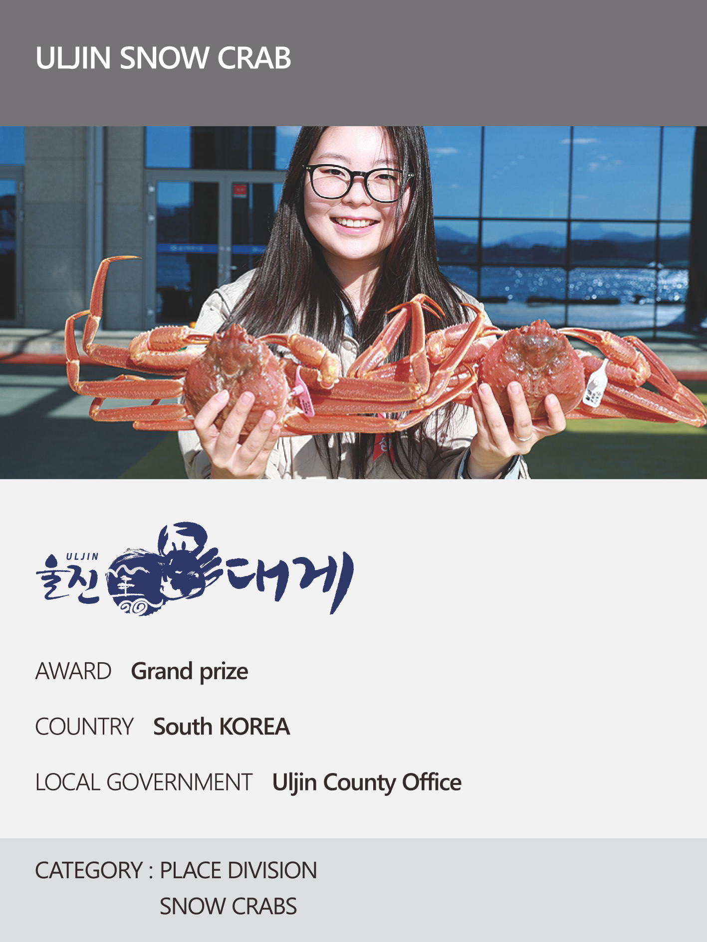 https://nyfknba.com/wp-content/uploads/2026/04/homepage_PL-15.jpg
1889
1417
nyfknba
https://nyfknba.com/wp-content/uploads/2025/11/nyf_logo1.svg
nyfknba2026-04-08 13:53:132026-04-09 19:14:52ULJIN SNOW CRAB
https://nyfknba.com/wp-content/uploads/2026/04/homepage_PL-15.jpg
1889
1417
nyfknba
https://nyfknba.com/wp-content/uploads/2025/11/nyf_logo1.svg
nyfknba2026-04-08 13:53:132026-04-09 19:14:52ULJIN SNOW CRAB https://nyfknba.com/wp-content/uploads/2026/04/homepage_PL-14.jpg
1889
1417
nyfknba
https://nyfknba.com/wp-content/uploads/2025/11/nyf_logo1.svg
nyfknba2026-04-08 13:52:252026-04-10 15:16:42GOODTRAE WATERMELONS
https://nyfknba.com/wp-content/uploads/2026/04/homepage_PL-14.jpg
1889
1417
nyfknba
https://nyfknba.com/wp-content/uploads/2025/11/nyf_logo1.svg
nyfknba2026-04-08 13:52:252026-04-10 15:16:42GOODTRAE WATERMELONS https://nyfknba.com/wp-content/uploads/2026/04/homepage_PL-13.jpg
1889
1417
nyfknba
https://nyfknba.com/wp-content/uploads/2025/11/nyf_logo1.svg
nyfknba2026-04-08 13:51:442026-04-10 10:19:04GOESAN CLEAN RED PEPPER
https://nyfknba.com/wp-content/uploads/2026/04/homepage_PL-13.jpg
1889
1417
nyfknba
https://nyfknba.com/wp-content/uploads/2025/11/nyf_logo1.svg
nyfknba2026-04-08 13:51:442026-04-10 10:19:04GOESAN CLEAN RED PEPPER https://nyfknba.com/wp-content/uploads/2026/04/homepage_PL-12.jpg
1889
1417
nyfknba
https://nyfknba.com/wp-content/uploads/2025/11/nyf_logo1.svg
nyfknba2026-04-08 13:50:582026-04-09 18:57:44IMGEUMNIMPYO ICHEON HANWOO
https://nyfknba.com/wp-content/uploads/2026/04/homepage_PL-12.jpg
1889
1417
nyfknba
https://nyfknba.com/wp-content/uploads/2025/11/nyf_logo1.svg
nyfknba2026-04-08 13:50:582026-04-09 18:57:44IMGEUMNIMPYO ICHEON HANWOO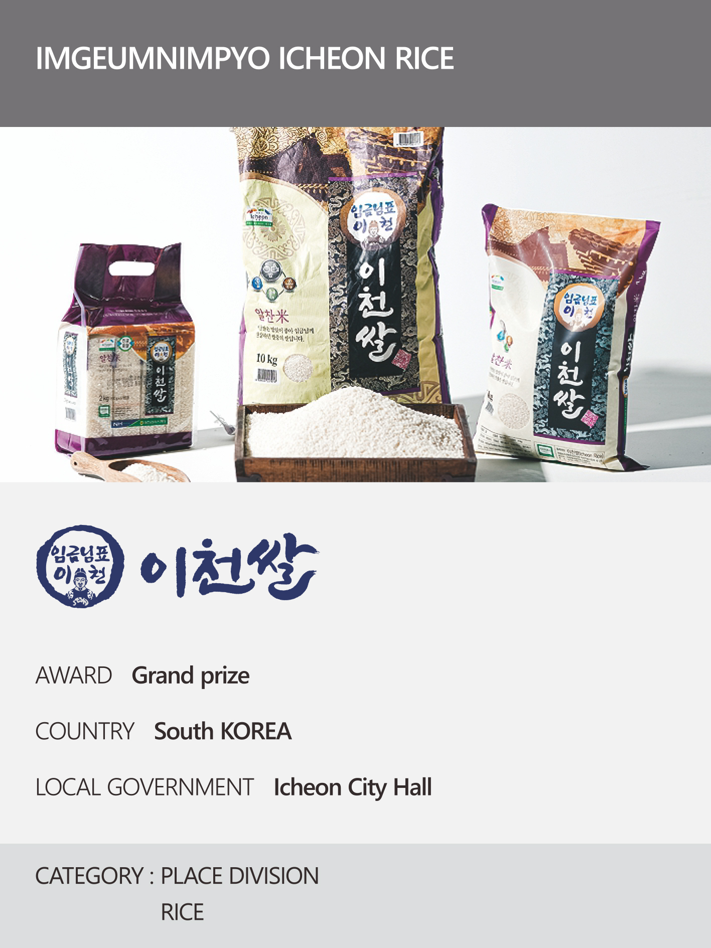 https://nyfknba.com/wp-content/uploads/2026/04/homepage_PL-11.jpg
1889
1417
nyfknba
https://nyfknba.com/wp-content/uploads/2025/11/nyf_logo1.svg
nyfknba2026-04-08 13:50:012026-04-09 18:52:18IMGEUMNIMPYO ICHEON RICE
https://nyfknba.com/wp-content/uploads/2026/04/homepage_PL-11.jpg
1889
1417
nyfknba
https://nyfknba.com/wp-content/uploads/2025/11/nyf_logo1.svg
nyfknba2026-04-08 13:50:012026-04-09 18:52:18IMGEUMNIMPYO ICHEON RICE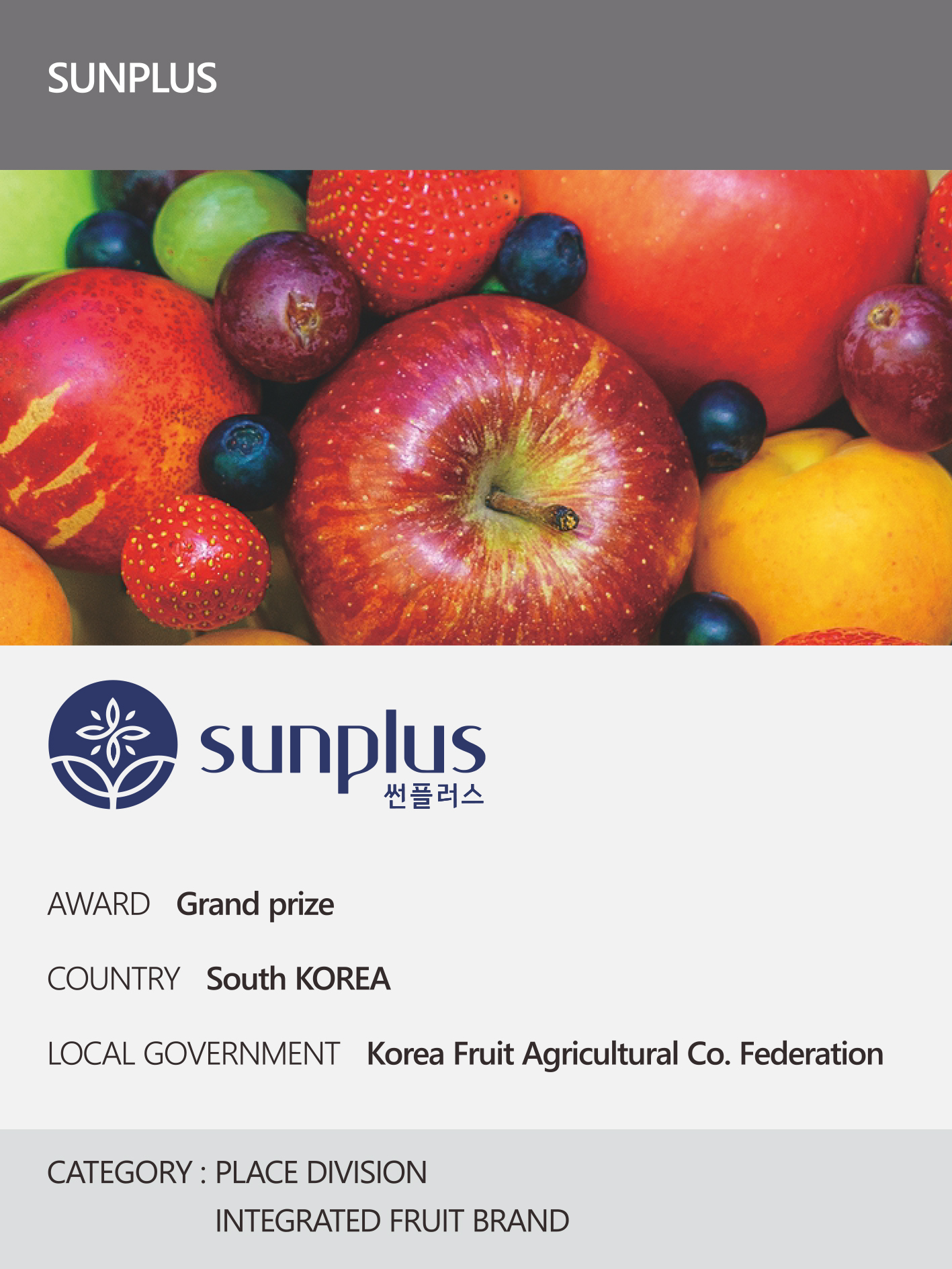 https://nyfknba.com/wp-content/uploads/2026/04/homepage_PL-10.jpg
1889
1417
nyfknba
https://nyfknba.com/wp-content/uploads/2025/11/nyf_logo1.svg
nyfknba2026-04-08 13:49:212026-04-09 18:47:48SUNPLUS
https://nyfknba.com/wp-content/uploads/2026/04/homepage_PL-10.jpg
1889
1417
nyfknba
https://nyfknba.com/wp-content/uploads/2025/11/nyf_logo1.svg
nyfknba2026-04-08 13:49:212026-04-09 18:47:48SUNPLUS https://nyfknba.com/wp-content/uploads/2026/04/homepage_PL-9.jpg
1889
1417
nyfknba
https://nyfknba.com/wp-content/uploads/2025/11/nyf_logo1.svg
nyfknba2026-04-08 13:48:242026-04-10 15:12:06GOODTRAE
https://nyfknba.com/wp-content/uploads/2026/04/homepage_PL-9.jpg
1889
1417
nyfknba
https://nyfknba.com/wp-content/uploads/2025/11/nyf_logo1.svg
nyfknba2026-04-08 13:48:242026-04-10 15:12:06GOODTRAE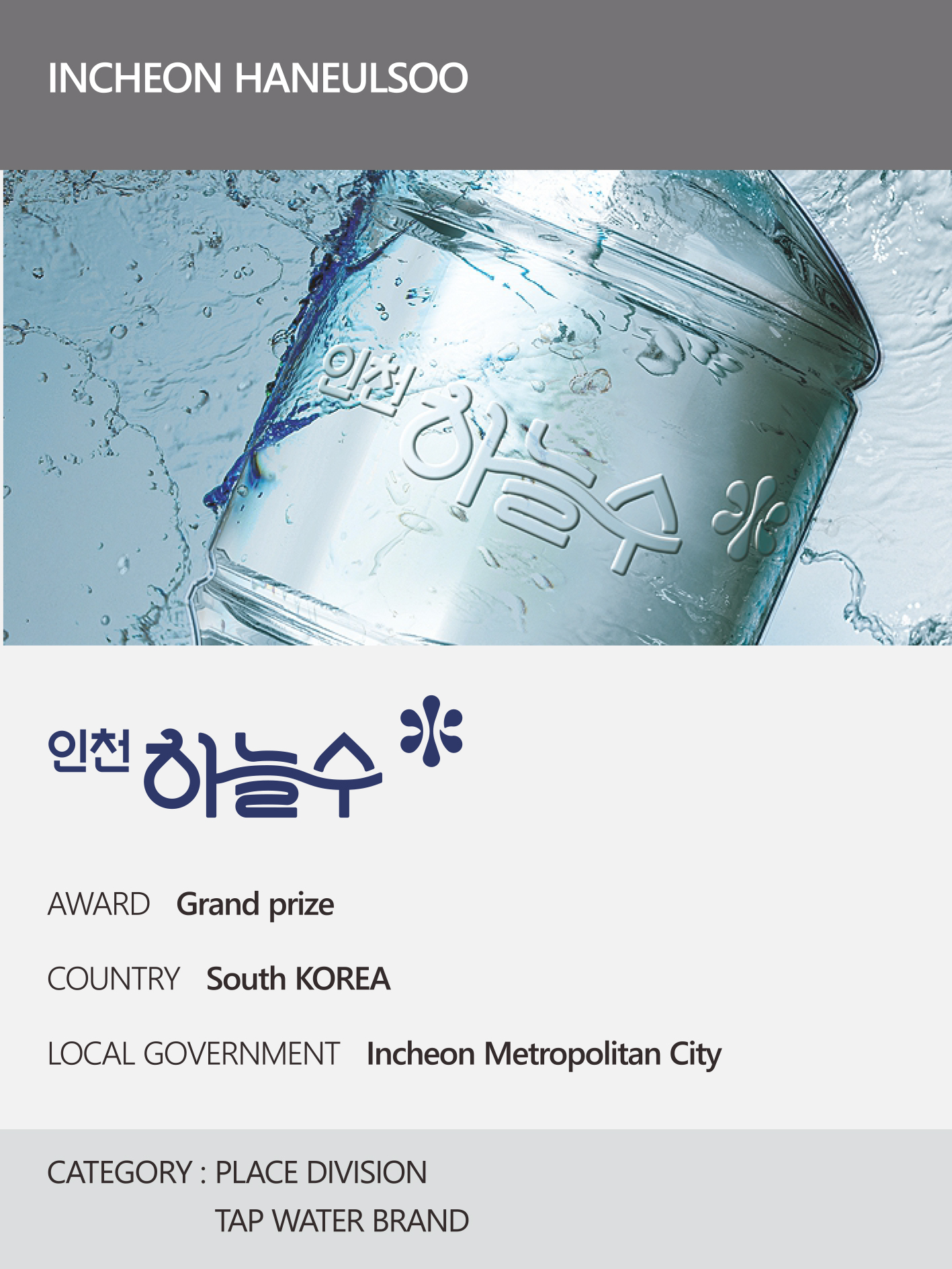 https://nyfknba.com/wp-content/uploads/2026/04/homepage_PL-8.jpg
1889
1417
nyfknba
https://nyfknba.com/wp-content/uploads/2025/11/nyf_logo1.svg
nyfknba2026-04-08 13:46:532026-04-09 18:41:12INCHEON HANEULSOO
https://nyfknba.com/wp-content/uploads/2026/04/homepage_PL-8.jpg
1889
1417
nyfknba
https://nyfknba.com/wp-content/uploads/2025/11/nyf_logo1.svg
nyfknba2026-04-08 13:46:532026-04-09 18:41:12INCHEON HANEULSOO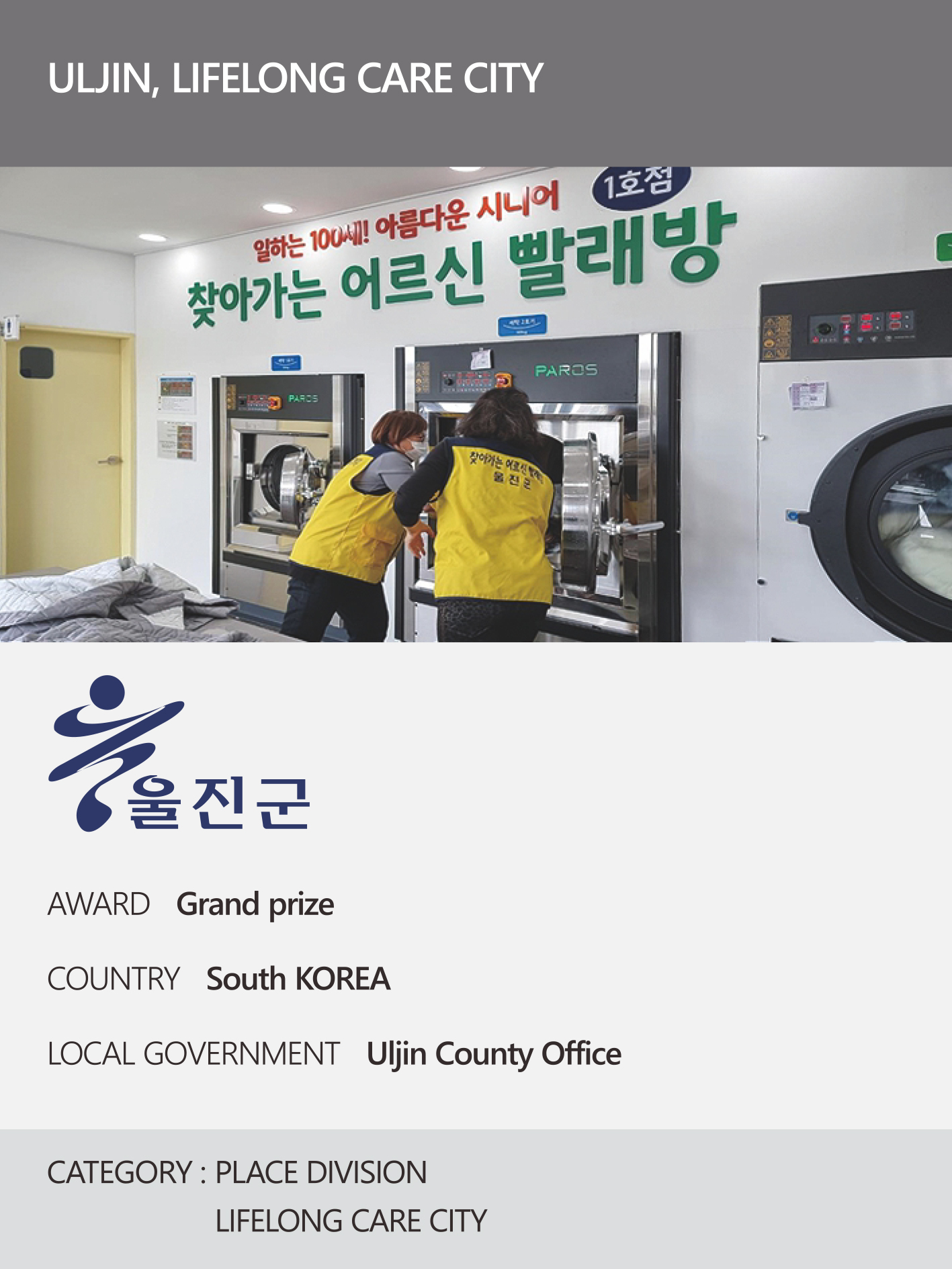 https://nyfknba.com/wp-content/uploads/2026/04/homepage_PL-7.jpg
1889
1417
nyfknba
https://nyfknba.com/wp-content/uploads/2025/11/nyf_logo1.svg
nyfknba2026-04-08 13:46:172026-04-09 18:36:16ULJIN, LIFELONG CARE CITY
https://nyfknba.com/wp-content/uploads/2026/04/homepage_PL-7.jpg
1889
1417
nyfknba
https://nyfknba.com/wp-content/uploads/2025/11/nyf_logo1.svg
nyfknba2026-04-08 13:46:172026-04-09 18:36:16ULJIN, LIFELONG CARE CITY https://nyfknba.com/wp-content/uploads/2026/04/homepage_PL-6.jpg
1889
1417
nyfknba
https://nyfknba.com/wp-content/uploads/2025/11/nyf_logo1.svg
nyfknba2026-04-08 13:45:382026-04-09 18:28:17GOESAN, ECO-FRIENDLY ORGANIC FARMING CITY
https://nyfknba.com/wp-content/uploads/2026/04/homepage_PL-6.jpg
1889
1417
nyfknba
https://nyfknba.com/wp-content/uploads/2025/11/nyf_logo1.svg
nyfknba2026-04-08 13:45:382026-04-09 18:28:17GOESAN, ECO-FRIENDLY ORGANIC FARMING CITY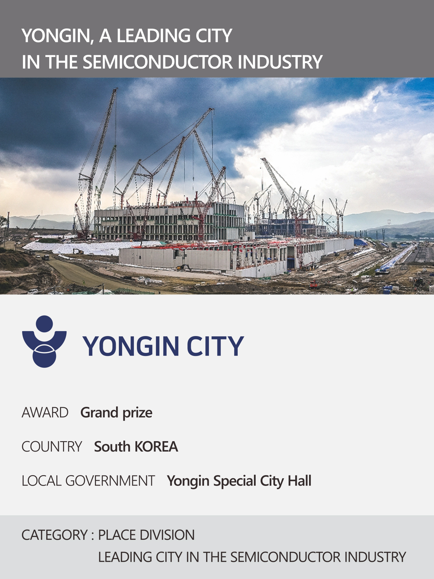 https://nyfknba.com/wp-content/uploads/2026/04/homepage_PL-교체-3건-3.jpg
1890
1417
nyfknba
https://nyfknba.com/wp-content/uploads/2025/11/nyf_logo1.svg
nyfknba2026-04-08 13:44:422026-04-10 15:09:01YONGIN CITY HALL
https://nyfknba.com/wp-content/uploads/2026/04/homepage_PL-교체-3건-3.jpg
1890
1417
nyfknba
https://nyfknba.com/wp-content/uploads/2025/11/nyf_logo1.svg
nyfknba2026-04-08 13:44:422026-04-10 15:09:01YONGIN CITY HALL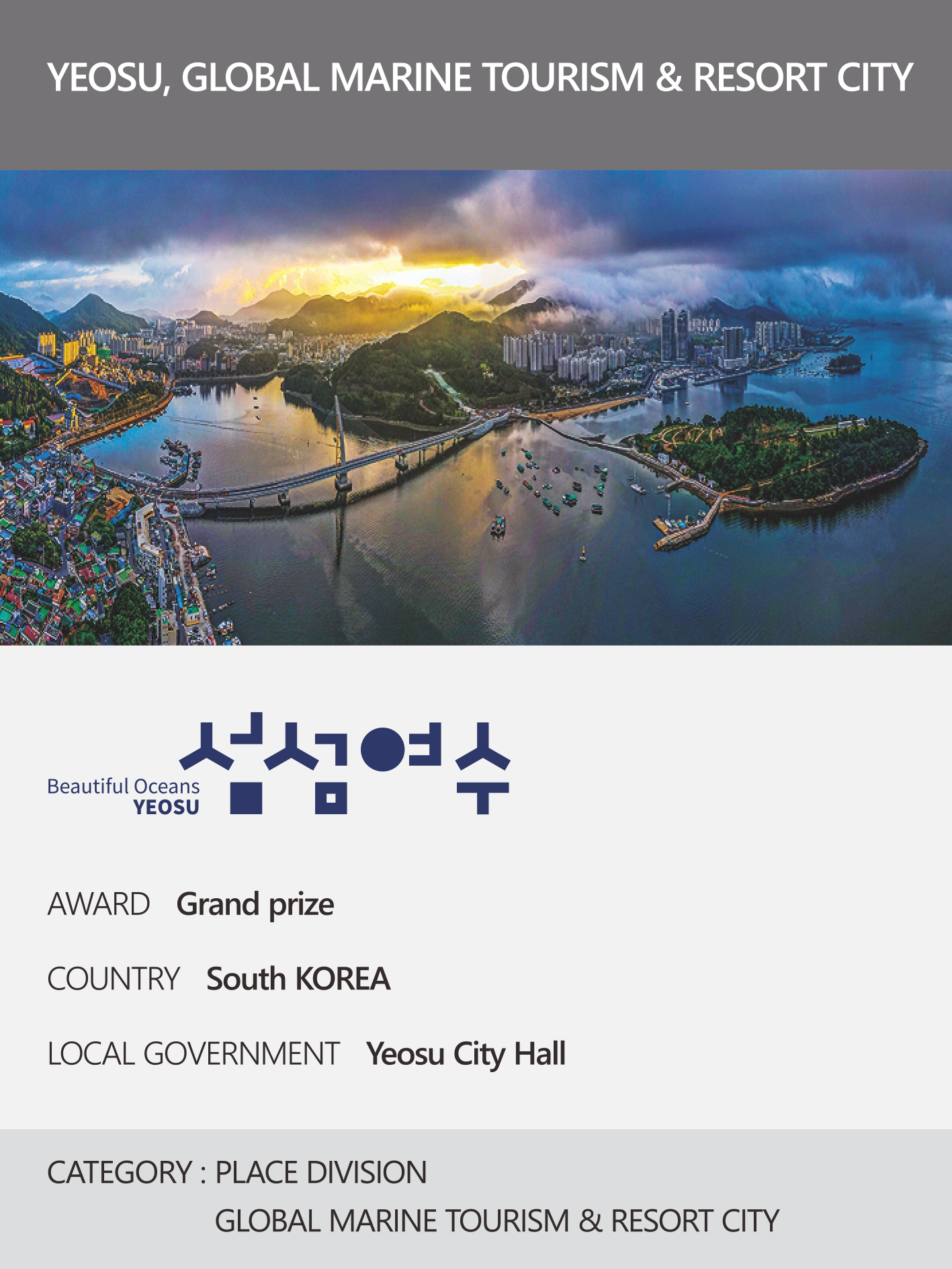 https://nyfknba.com/wp-content/uploads/2026/04/homepage_PL-4.jpg
1889
1417
nyfknba
https://nyfknba.com/wp-content/uploads/2025/11/nyf_logo1.svg
nyfknba2026-04-08 13:43:412026-04-09 18:15:24YEOSU, GLOBAL MARINE TOURISM & RESORT CITY
https://nyfknba.com/wp-content/uploads/2026/04/homepage_PL-4.jpg
1889
1417
nyfknba
https://nyfknba.com/wp-content/uploads/2025/11/nyf_logo1.svg
nyfknba2026-04-08 13:43:412026-04-09 18:15:24YEOSU, GLOBAL MARINE TOURISM & RESORT CITY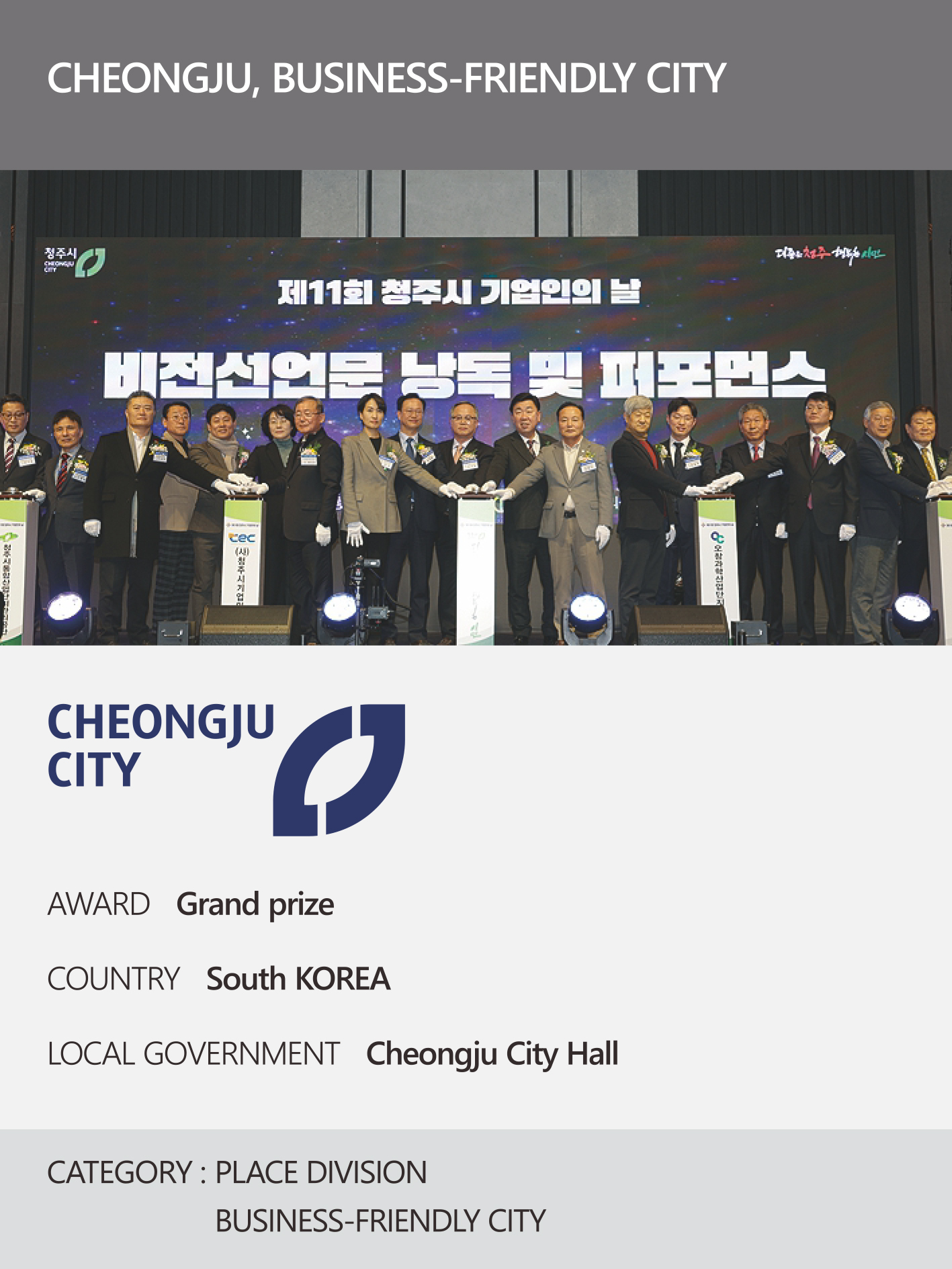 https://nyfknba.com/wp-content/uploads/2026/04/homepage_PL-3.jpg
1889
1417
nyfknba
https://nyfknba.com/wp-content/uploads/2025/11/nyf_logo1.svg
nyfknba2026-04-08 13:42:102026-04-09 18:11:31CHEONGJU, BUSINESS-FRIENDLY CITY
https://nyfknba.com/wp-content/uploads/2026/04/homepage_PL-교체-3건-2.jpg
1890
1417
nyfknba
https://nyfknba.com/wp-content/uploads/2025/11/nyf_logo1.svg
nyfknba2026-04-08 13:40:322026-04-10 15:05:29SUN RIGING SEOSAN
https://nyfknba.com/wp-content/uploads/2026/04/homepage_PL-3.jpg
1889
1417
nyfknba
https://nyfknba.com/wp-content/uploads/2025/11/nyf_logo1.svg
nyfknba2026-04-08 13:42:102026-04-09 18:11:31CHEONGJU, BUSINESS-FRIENDLY CITY
https://nyfknba.com/wp-content/uploads/2026/04/homepage_PL-교체-3건-2.jpg
1890
1417
nyfknba
https://nyfknba.com/wp-content/uploads/2025/11/nyf_logo1.svg
nyfknba2026-04-08 13:40:322026-04-10 15:05:29SUN RIGING SEOSAN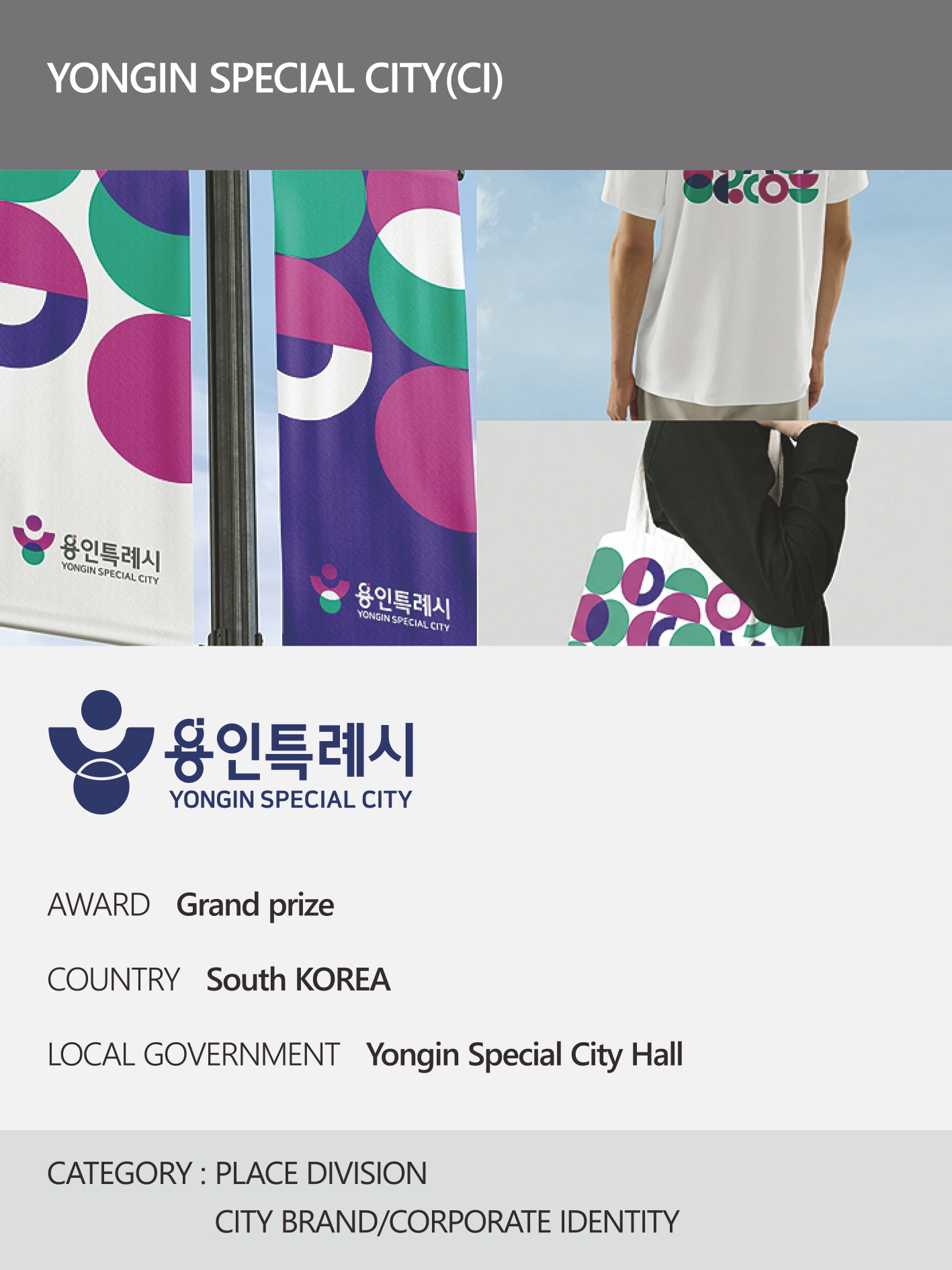 https://nyfknba.com/wp-content/uploads/2026/04/homepage_PL-교체-3건-1.jpg
1890
1417
nyfknba
https://nyfknba.com/wp-content/uploads/2025/11/nyf_logo1.svg
nyfknba2026-04-08 13:39:392026-04-10 15:01:38YONGIN SPECIAL CITY HALL
https://nyfknba.com/wp-content/uploads/2026/04/homepage_PL-교체-3건-1.jpg
1890
1417
nyfknba
https://nyfknba.com/wp-content/uploads/2025/11/nyf_logo1.svg
nyfknba2026-04-08 13:39:392026-04-10 15:01:38YONGIN SPECIAL CITY HALL https://nyfknba.com/wp-content/uploads/2026/04/homepage_IL-40-2.jpg
1889
1417
nyfknba
https://nyfknba.com/wp-content/uploads/2025/11/nyf_logo1.svg
nyfknba2026-04-08 13:36:582026-04-09 17:59:48LOCK&LOCK
https://nyfknba.com/wp-content/uploads/2026/04/homepage_IL-40-2.jpg
1889
1417
nyfknba
https://nyfknba.com/wp-content/uploads/2025/11/nyf_logo1.svg
nyfknba2026-04-08 13:36:582026-04-09 17:59:48LOCK&LOCK https://nyfknba.com/wp-content/uploads/2026/04/homepage_IL-39-1.jpg
1889
1417
nyfknba
https://nyfknba.com/wp-content/uploads/2025/11/nyf_logo1.svg
nyfknba2026-04-08 13:36:022026-04-09 17:56:48KCC
https://nyfknba.com/wp-content/uploads/2026/04/homepage_IL-39-1.jpg
1889
1417
nyfknba
https://nyfknba.com/wp-content/uploads/2025/11/nyf_logo1.svg
nyfknba2026-04-08 13:36:022026-04-09 17:56:48KCC https://nyfknba.com/wp-content/uploads/2026/04/homepage_IL-38-1.jpg
1889
1417
nyfknba
https://nyfknba.com/wp-content/uploads/2025/11/nyf_logo1.svg
nyfknba2026-04-08 13:35:092026-04-09 17:55:06KYUNGSUNG MUNHWASA
https://nyfknba.com/wp-content/uploads/2026/04/homepage_IL-38-1.jpg
1889
1417
nyfknba
https://nyfknba.com/wp-content/uploads/2025/11/nyf_logo1.svg
nyfknba2026-04-08 13:35:092026-04-09 17:55:06KYUNGSUNG MUNHWASA https://nyfknba.com/wp-content/uploads/2026/04/homepage_IL-37-1.jpg
1889
1417
nyfknba
https://nyfknba.com/wp-content/uploads/2025/11/nyf_logo1.svg
nyfknba2026-04-08 13:34:132026-04-09 17:51:08WOONGJIN PREEDLIFE
https://nyfknba.com/wp-content/uploads/2026/04/homepage_IL-37-1.jpg
1889
1417
nyfknba
https://nyfknba.com/wp-content/uploads/2025/11/nyf_logo1.svg
nyfknba2026-04-08 13:34:132026-04-09 17:51:08WOONGJIN PREEDLIFE https://nyfknba.com/wp-content/uploads/2026/04/homepage_IL-36-1.jpg
1889
1417
nyfknba
https://nyfknba.com/wp-content/uploads/2025/11/nyf_logo1.svg
nyfknba2026-04-08 13:32:062026-04-09 17:48:04HANATOUR
https://nyfknba.com/wp-content/uploads/2026/04/homepage_IL-36-1.jpg
1889
1417
nyfknba
https://nyfknba.com/wp-content/uploads/2025/11/nyf_logo1.svg
nyfknba2026-04-08 13:32:062026-04-09 17:48:04HANATOUR https://nyfknba.com/wp-content/uploads/2026/04/homepage_IL-35-1.jpg
1889
1417
nyfknba
https://nyfknba.com/wp-content/uploads/2025/11/nyf_logo1.svg
nyfknba2026-04-08 13:32:032026-04-09 17:44:07COMPOSE COFFEE
https://nyfknba.com/wp-content/uploads/2026/04/homepage_IL-35-1.jpg
1889
1417
nyfknba
https://nyfknba.com/wp-content/uploads/2025/11/nyf_logo1.svg
nyfknba2026-04-08 13:32:032026-04-09 17:44:07COMPOSE COFFEE https://nyfknba.com/wp-content/uploads/2026/04/homepage_IL-34-1.jpg
1889
1417
nyfknba
https://nyfknba.com/wp-content/uploads/2025/11/nyf_logo1.svg
nyfknba2026-04-08 13:31:182026-04-09 17:36:15VAINER
https://nyfknba.com/wp-content/uploads/2026/04/homepage_IL-34-1.jpg
1889
1417
nyfknba
https://nyfknba.com/wp-content/uploads/2025/11/nyf_logo1.svg
nyfknba2026-04-08 13:31:182026-04-09 17:36:15VAINER https://nyfknba.com/wp-content/uploads/2026/04/homepage_IL-33-2.jpg
1889
1417
nyfknba
https://nyfknba.com/wp-content/uploads/2025/11/nyf_logo1.svg
nyfknba2026-04-08 13:29:572026-04-09 17:32:53SIWONSCHOOL
https://nyfknba.com/wp-content/uploads/2026/04/homepage_IL-33-2.jpg
1889
1417
nyfknba
https://nyfknba.com/wp-content/uploads/2025/11/nyf_logo1.svg
nyfknba2026-04-08 13:29:572026-04-09 17:32:53SIWONSCHOOL https://nyfknba.com/wp-content/uploads/2026/04/homepage_IL-32-2.jpg
1889
1417
nyfknba
https://nyfknba.com/wp-content/uploads/2025/11/nyf_logo1.svg
nyfknba2026-04-08 13:28:562026-04-09 17:29:26SAMSUNG MEDICAL CENTER
https://nyfknba.com/wp-content/uploads/2026/04/homepage_IL-32-2.jpg
1889
1417
nyfknba
https://nyfknba.com/wp-content/uploads/2025/11/nyf_logo1.svg
nyfknba2026-04-08 13:28:562026-04-09 17:29:26SAMSUNG MEDICAL CENTER https://nyfknba.com/wp-content/uploads/2026/04/homepage_IL-31-1.jpg
1889
1417
nyfknba
https://nyfknba.com/wp-content/uploads/2025/11/nyf_logo1.svg
nyfknba2026-04-08 13:28:132026-04-09 17:15:30GOONGBE
https://nyfknba.com/wp-content/uploads/2026/04/homepage_IL-31-1.jpg
1889
1417
nyfknba
https://nyfknba.com/wp-content/uploads/2025/11/nyf_logo1.svg
nyfknba2026-04-08 13:28:132026-04-09 17:15:30GOONGBE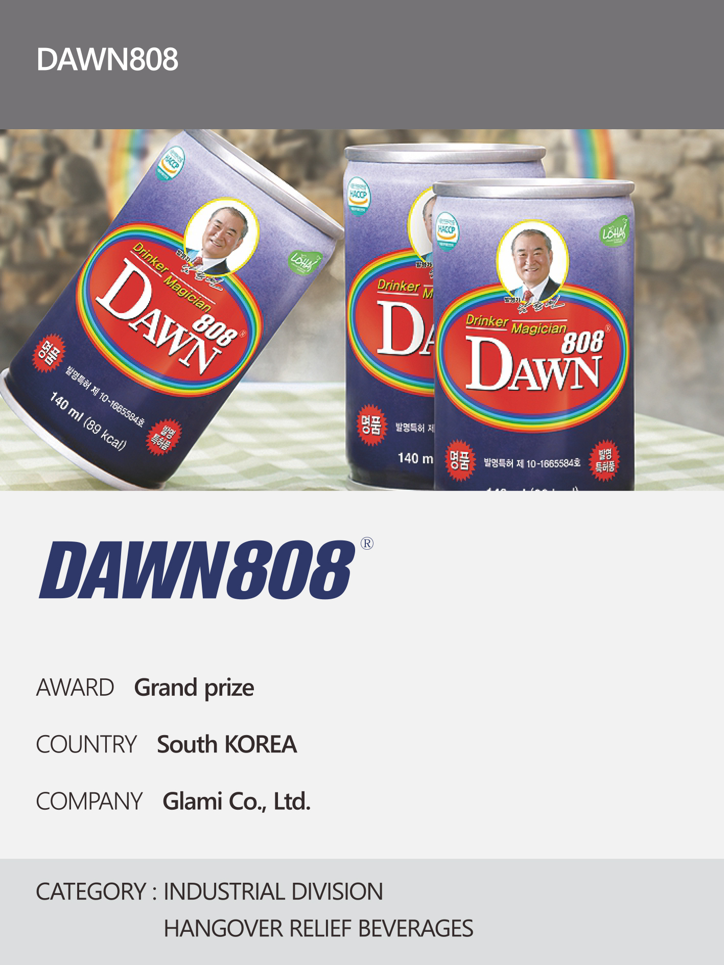 https://nyfknba.com/wp-content/uploads/2026/04/homepage_IL-30-1.jpg
1889
1417
nyfknba
https://nyfknba.com/wp-content/uploads/2025/11/nyf_logo1.svg
nyfknba2026-04-08 13:27:202026-04-09 17:12:13DAWN808
https://nyfknba.com/wp-content/uploads/2026/04/homepage_IL-30-1.jpg
1889
1417
nyfknba
https://nyfknba.com/wp-content/uploads/2025/11/nyf_logo1.svg
nyfknba2026-04-08 13:27:202026-04-09 17:12:13DAWN808 https://nyfknba.com/wp-content/uploads/2026/04/homepage_IL-29-1.jpg
1889
1417
nyfknba
https://nyfknba.com/wp-content/uploads/2025/11/nyf_logo1.svg
nyfknba2026-04-08 13:26:292026-04-09 17:06:18SAMJIN AMOOK
https://nyfknba.com/wp-content/uploads/2026/04/homepage_IL-29-1.jpg
1889
1417
nyfknba
https://nyfknba.com/wp-content/uploads/2025/11/nyf_logo1.svg
nyfknba2026-04-08 13:26:292026-04-09 17:06:18SAMJIN AMOOK https://nyfknba.com/wp-content/uploads/2026/04/homepage_IL-28-1.jpg
1889
1417
nyfknba
https://nyfknba.com/wp-content/uploads/2025/11/nyf_logo1.svg
nyfknba2026-04-08 13:24:582026-04-09 17:01:58TERRA
https://nyfknba.com/wp-content/uploads/2026/04/homepage_IL-28-1.jpg
1889
1417
nyfknba
https://nyfknba.com/wp-content/uploads/2025/11/nyf_logo1.svg
nyfknba2026-04-08 13:24:582026-04-09 17:01:58TERRA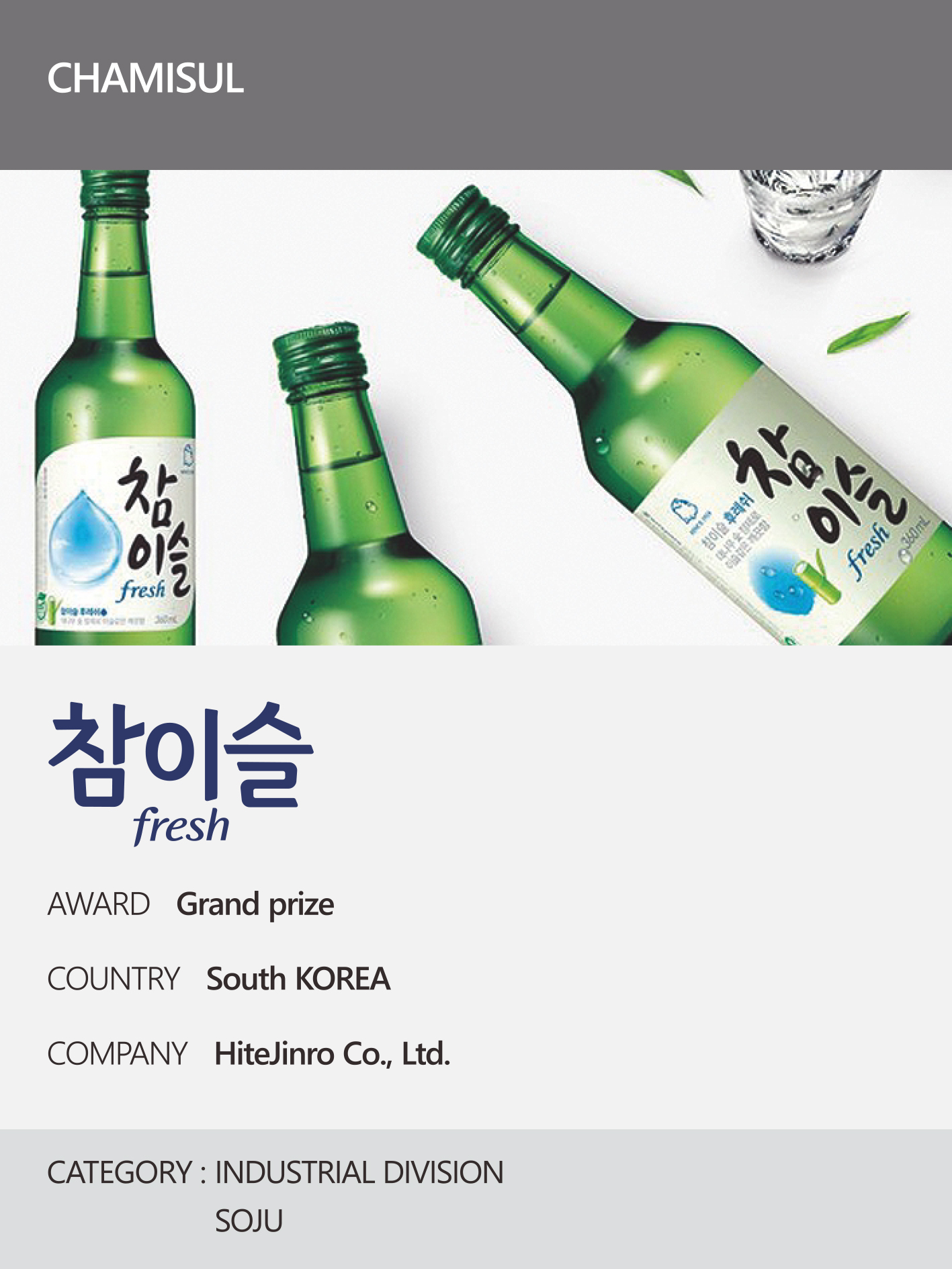 https://nyfknba.com/wp-content/uploads/2026/04/homepage_IL-27-1.jpg
1889
1417
nyfknba
https://nyfknba.com/wp-content/uploads/2025/11/nyf_logo1.svg
nyfknba2026-04-08 13:23:552026-04-09 16:55:57CHAMISUL
https://nyfknba.com/wp-content/uploads/2026/04/homepage_IL-27-1.jpg
1889
1417
nyfknba
https://nyfknba.com/wp-content/uploads/2025/11/nyf_logo1.svg
nyfknba2026-04-08 13:23:552026-04-09 16:55:57CHAMISUL https://nyfknba.com/wp-content/uploads/2026/04/homepage_IL-26-2.jpg
1889
1417
nyfknba
https://nyfknba.com/wp-content/uploads/2025/11/nyf_logo1.svg
nyfknba2026-04-08 13:23:032026-04-10 14:59:17PIGEON
https://nyfknba.com/wp-content/uploads/2026/04/homepage_IL-26-2.jpg
1889
1417
nyfknba
https://nyfknba.com/wp-content/uploads/2025/11/nyf_logo1.svg
nyfknba2026-04-08 13:23:032026-04-10 14:59:17PIGEON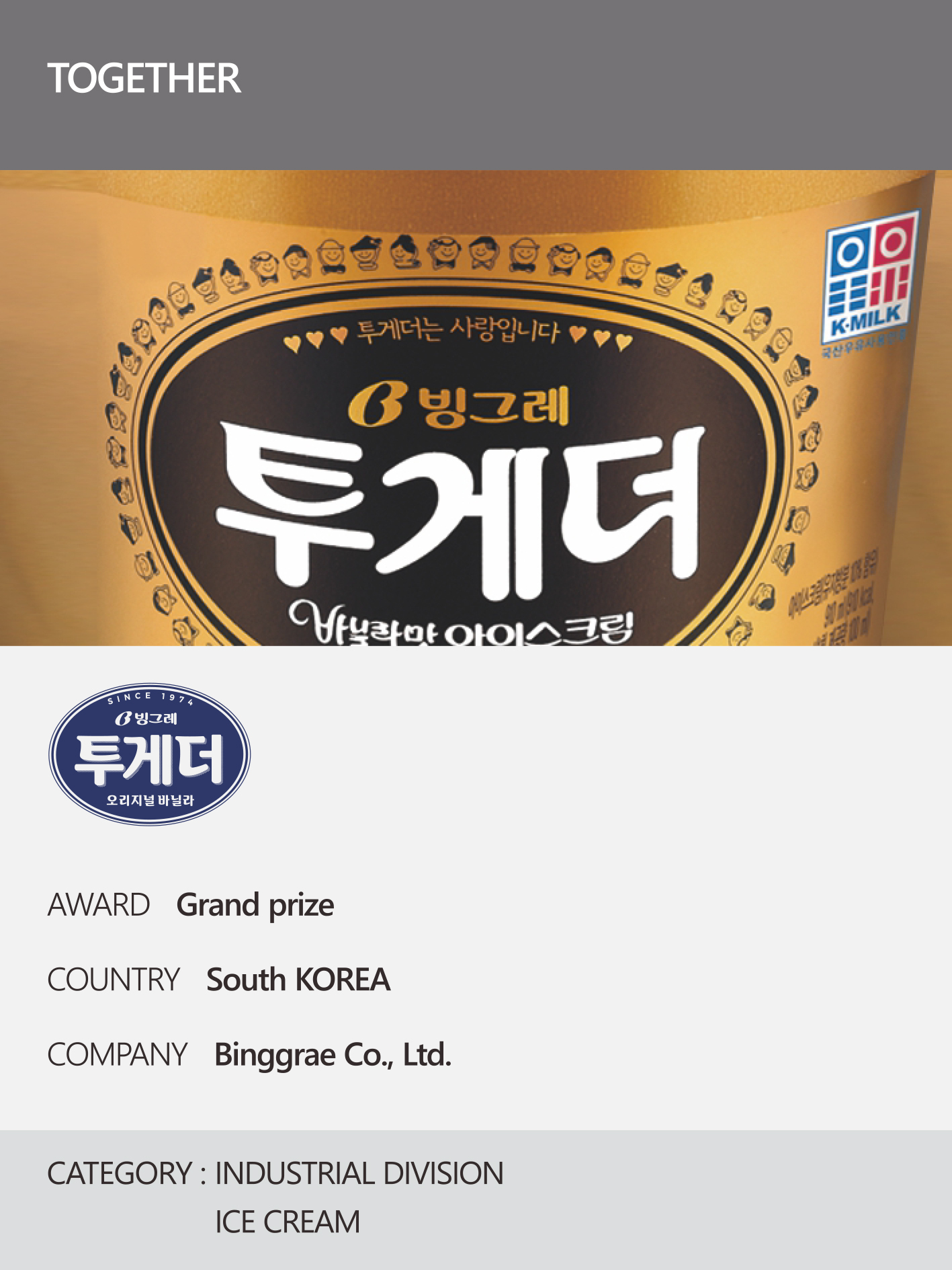 https://nyfknba.com/wp-content/uploads/2026/04/homepage_IL-25-1.jpg
1889
1417
nyfknba
https://nyfknba.com/wp-content/uploads/2025/11/nyf_logo1.svg
nyfknba2026-04-08 13:22:132026-04-09 16:50:26TOGETHER
https://nyfknba.com/wp-content/uploads/2026/04/homepage_IL-25-1.jpg
1889
1417
nyfknba
https://nyfknba.com/wp-content/uploads/2025/11/nyf_logo1.svg
nyfknba2026-04-08 13:22:132026-04-09 16:50:26TOGETHER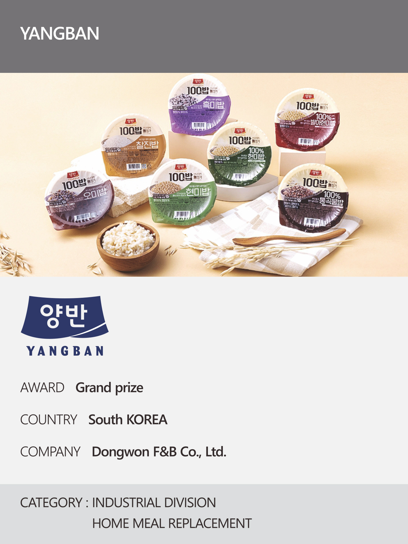 https://nyfknba.com/wp-content/uploads/2026/04/homepage_IL-23-1.jpg
1889
1417
nyfknba
https://nyfknba.com/wp-content/uploads/2025/11/nyf_logo1.svg
nyfknba2026-04-08 13:21:142026-04-09 16:47:38YANGBAN
https://nyfknba.com/wp-content/uploads/2026/04/homepage_IL-23-1.jpg
1889
1417
nyfknba
https://nyfknba.com/wp-content/uploads/2025/11/nyf_logo1.svg
nyfknba2026-04-08 13:21:142026-04-09 16:47:38YANGBAN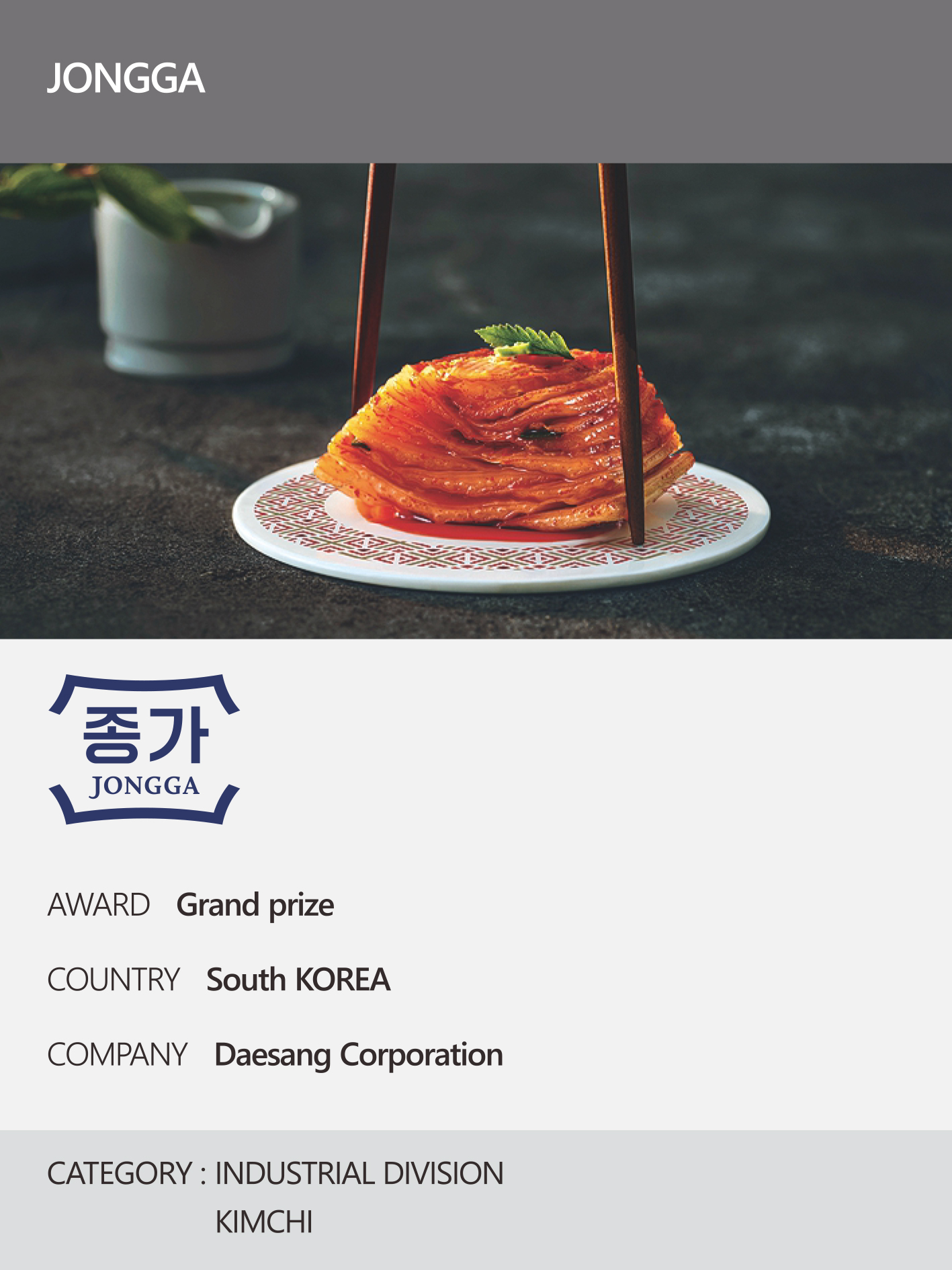 https://nyfknba.com/wp-content/uploads/2026/04/homepage_IL-24-1.jpg
1889
1417
nyfknba
https://nyfknba.com/wp-content/uploads/2025/11/nyf_logo1.svg
nyfknba2026-04-08 13:20:252026-04-09 16:36:25JONGGA
https://nyfknba.com/wp-content/uploads/2026/04/homepage_IL-24-1.jpg
1889
1417
nyfknba
https://nyfknba.com/wp-content/uploads/2025/11/nyf_logo1.svg
nyfknba2026-04-08 13:20:252026-04-09 16:36:25JONGGA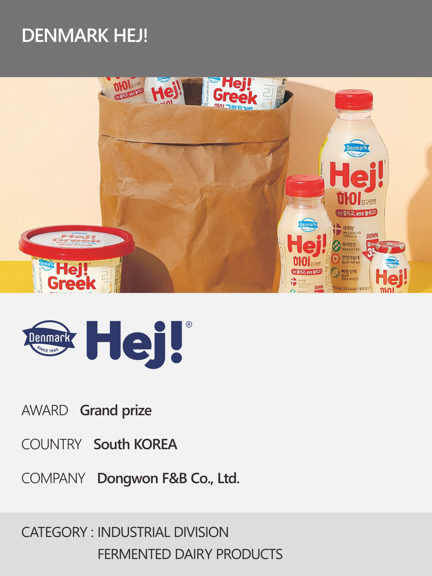 https://nyfknba.com/wp-content/uploads/2026/04/homepage_IL-22-1.jpg
1889
1417
nyfknba
https://nyfknba.com/wp-content/uploads/2025/11/nyf_logo1.svg
nyfknba2026-04-08 13:19:392026-04-10 09:23:08DENMARK HEJ!
https://nyfknba.com/wp-content/uploads/2026/04/homepage_IL-22-1.jpg
1889
1417
nyfknba
https://nyfknba.com/wp-content/uploads/2025/11/nyf_logo1.svg
nyfknba2026-04-08 13:19:392026-04-10 09:23:08DENMARK HEJ! https://nyfknba.com/wp-content/uploads/2026/04/homepage_IL-21-1.jpg
1889
1417
nyfknba
https://nyfknba.com/wp-content/uploads/2025/11/nyf_logo1.svg
nyfknba2026-04-08 13:18:112026-04-10 09:18:25KYUNGBOK UNIVERSITY
https://nyfknba.com/wp-content/uploads/2026/04/homepage_IL-21-1.jpg
1889
1417
nyfknba
https://nyfknba.com/wp-content/uploads/2025/11/nyf_logo1.svg
nyfknba2026-04-08 13:18:112026-04-10 09:18:25KYUNGBOK UNIVERSITY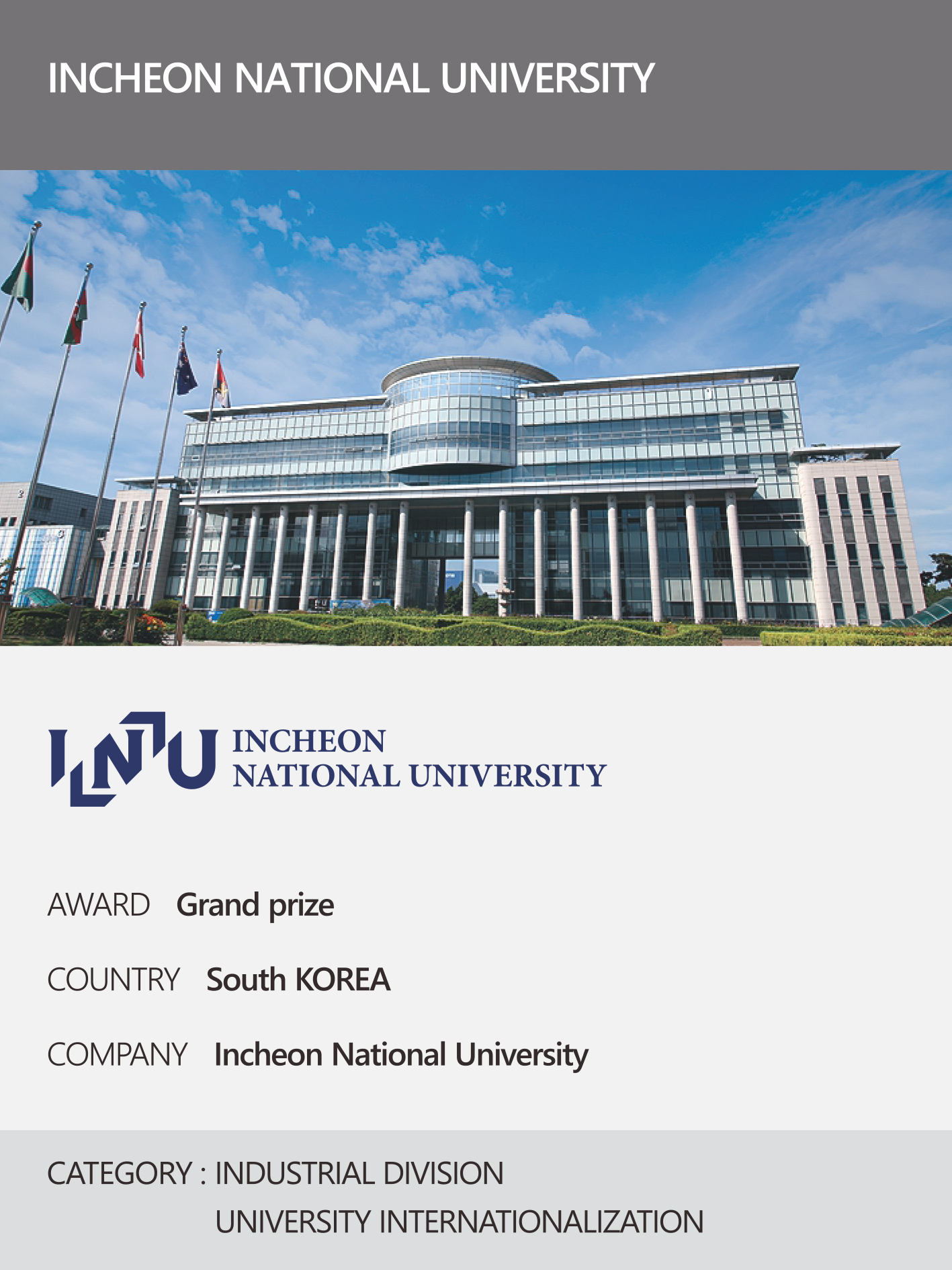 https://nyfknba.com/wp-content/uploads/2026/04/homepage_IL-20-1.jpg
1889
1417
nyfknba
https://nyfknba.com/wp-content/uploads/2025/11/nyf_logo1.svg
nyfknba2026-04-08 13:16:462026-04-09 16:19:56INCHEON NATIONAL UNIVERSITY
https://nyfknba.com/wp-content/uploads/2026/04/homepage_IL-20-1.jpg
1889
1417
nyfknba
https://nyfknba.com/wp-content/uploads/2025/11/nyf_logo1.svg
nyfknba2026-04-08 13:16:462026-04-09 16:19:56INCHEON NATIONAL UNIVERSITY https://nyfknba.com/wp-content/uploads/2026/04/homepage_IL-19-1.jpg
1889
1417
nyfknba
https://nyfknba.com/wp-content/uploads/2025/11/nyf_logo1.svg
nyfknba2026-04-08 13:15:572026-04-09 16:13:43CUCKOO
https://nyfknba.com/wp-content/uploads/2026/04/homepage_IL-19-1.jpg
1889
1417
nyfknba
https://nyfknba.com/wp-content/uploads/2025/11/nyf_logo1.svg
nyfknba2026-04-08 13:15:572026-04-09 16:13:43CUCKOO https://nyfknba.com/wp-content/uploads/2026/04/homepage_IL-18-1.jpg
1889
1417
nyfknba
https://nyfknba.com/wp-content/uploads/2025/11/nyf_logo1.svg
nyfknba2026-04-08 13:15:312026-04-09 16:06:58CUCKOO
https://nyfknba.com/wp-content/uploads/2026/04/homepage_IL-18-1.jpg
1889
1417
nyfknba
https://nyfknba.com/wp-content/uploads/2025/11/nyf_logo1.svg
nyfknba2026-04-08 13:15:312026-04-09 16:06:58CUCKOO https://nyfknba.com/wp-content/uploads/2026/04/homepage_IL-17-1.jpg
1889
1417
nyfknba
https://nyfknba.com/wp-content/uploads/2025/11/nyf_logo1.svg
nyfknba2026-04-08 13:14:442026-04-09 16:03:16LG ELECTRONICS
https://nyfknba.com/wp-content/uploads/2026/04/homepage_IL-17-1.jpg
1889
1417
nyfknba
https://nyfknba.com/wp-content/uploads/2025/11/nyf_logo1.svg
nyfknba2026-04-08 13:14:442026-04-09 16:03:16LG ELECTRONICS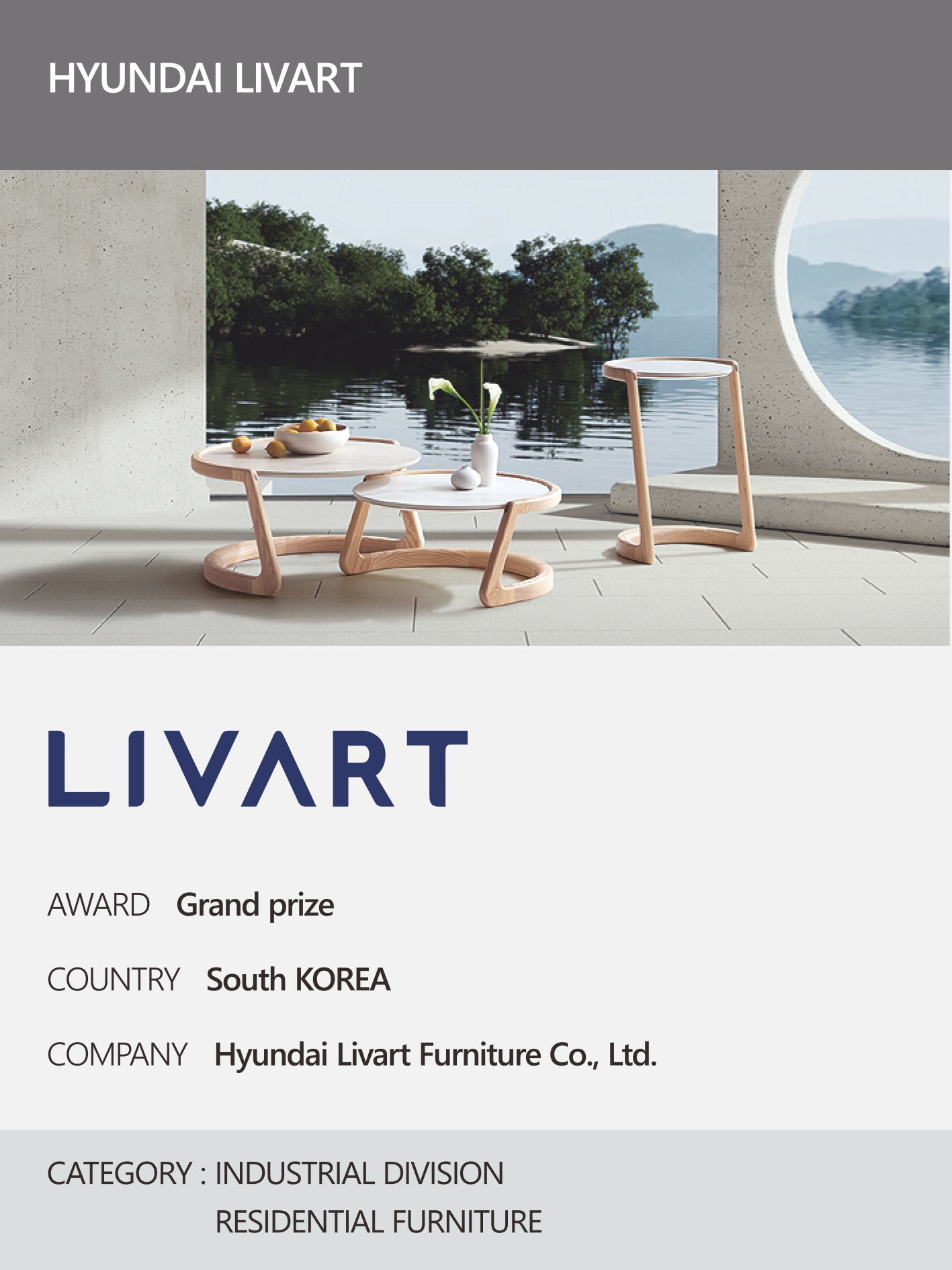 https://nyfknba.com/wp-content/uploads/2026/04/homepage_IL-16-1.jpg
1889
1417
nyfknba
https://nyfknba.com/wp-content/uploads/2025/11/nyf_logo1.svg
nyfknba2026-04-08 13:13:302026-04-09 15:59:26HYUNDAI LIVART
https://nyfknba.com/wp-content/uploads/2026/04/homepage_IL-16-1.jpg
1889
1417
nyfknba
https://nyfknba.com/wp-content/uploads/2025/11/nyf_logo1.svg
nyfknba2026-04-08 13:13:302026-04-09 15:59:26HYUNDAI LIVART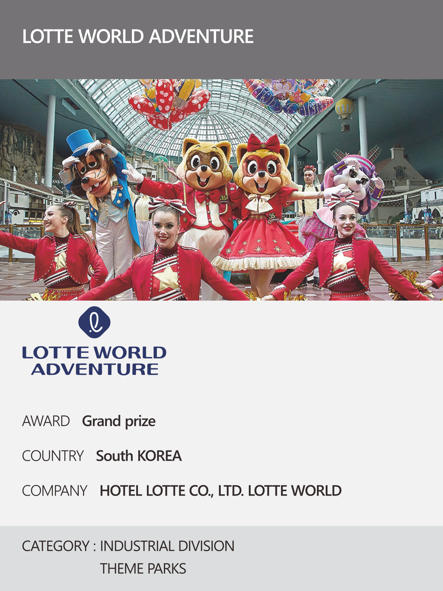 https://nyfknba.com/wp-content/uploads/2026/04/homepage_IL-15-1.jpg
1889
1417
nyfknba
https://nyfknba.com/wp-content/uploads/2025/11/nyf_logo1.svg
nyfknba2026-04-08 13:12:082026-04-09 15:56:14LOTTE WORLD ADVENTURE
https://nyfknba.com/wp-content/uploads/2026/04/homepage_IL-15-1.jpg
1889
1417
nyfknba
https://nyfknba.com/wp-content/uploads/2025/11/nyf_logo1.svg
nyfknba2026-04-08 13:12:082026-04-09 15:56:14LOTTE WORLD ADVENTURE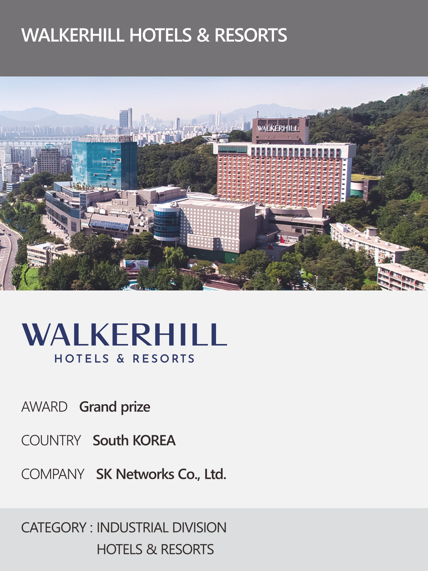 https://nyfknba.com/wp-content/uploads/2026/04/homepage_IL-14-1.jpg
1889
1417
nyfknba
https://nyfknba.com/wp-content/uploads/2025/11/nyf_logo1.svg
nyfknba2026-04-08 13:11:082026-04-09 15:50:40WALKERHILL HOTELS & RESORTS
https://nyfknba.com/wp-content/uploads/2026/04/homepage_IL-14-1.jpg
1889
1417
nyfknba
https://nyfknba.com/wp-content/uploads/2025/11/nyf_logo1.svg
nyfknba2026-04-08 13:11:082026-04-09 15:50:40WALKERHILL HOTELS & RESORTS https://nyfknba.com/wp-content/uploads/2026/04/homepage_IL-13-1.jpg
1889
1417
nyfknba
https://nyfknba.com/wp-content/uploads/2025/11/nyf_logo1.svg
nyfknba2026-04-08 13:10:122026-04-09 15:45:38LG UPLUS HOME SERVICE
https://nyfknba.com/wp-content/uploads/2026/04/homepage_IL-13-1.jpg
1889
1417
nyfknba
https://nyfknba.com/wp-content/uploads/2025/11/nyf_logo1.svg
nyfknba2026-04-08 13:10:122026-04-09 15:45:38LG UPLUS HOME SERVICE https://nyfknba.com/wp-content/uploads/2026/04/homepage_IL-12.jpg
1889
1417
nyfknba
https://nyfknba.com/wp-content/uploads/2025/11/nyf_logo1.svg
nyfknba2026-04-08 13:09:242026-04-09 15:35:55KIA MEMBERS
https://nyfknba.com/wp-content/uploads/2026/04/homepage_IL-12.jpg
1889
1417
nyfknba
https://nyfknba.com/wp-content/uploads/2025/11/nyf_logo1.svg
nyfknba2026-04-08 13:09:242026-04-09 15:35:55KIA MEMBERS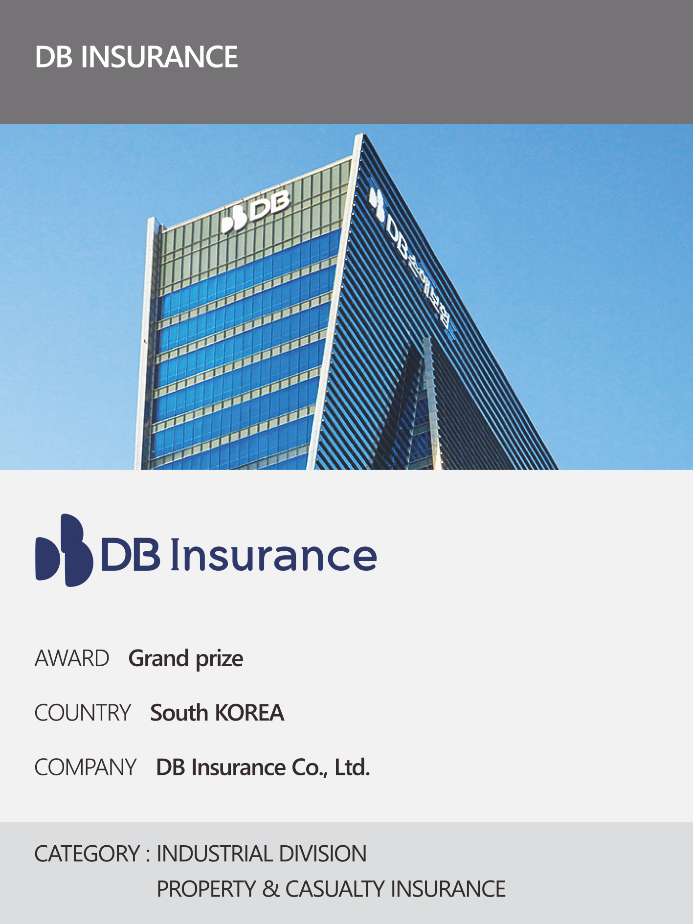 https://nyfknba.com/wp-content/uploads/2026/04/homepage_IL-11-1.jpg
1889
1417
nyfknba
https://nyfknba.com/wp-content/uploads/2025/11/nyf_logo1.svg
nyfknba2026-04-08 13:08:262026-04-09 15:32:45DB INSURANCE
https://nyfknba.com/wp-content/uploads/2026/04/homepage_IL-11-1.jpg
1889
1417
nyfknba
https://nyfknba.com/wp-content/uploads/2025/11/nyf_logo1.svg
nyfknba2026-04-08 13:08:262026-04-09 15:32:45DB INSURANCE https://nyfknba.com/wp-content/uploads/2026/04/homepage_IL-10-1.jpg
1889
1417
nyfknba
https://nyfknba.com/wp-content/uploads/2025/11/nyf_logo1.svg
nyfknba2026-04-08 13:07:362026-04-09 15:29:31NH INVESTMENT & SECURITIES
https://nyfknba.com/wp-content/uploads/2026/04/homepage_IL-10-1.jpg
1889
1417
nyfknba
https://nyfknba.com/wp-content/uploads/2025/11/nyf_logo1.svg
nyfknba2026-04-08 13:07:362026-04-09 15:29:31NH INVESTMENT & SECURITIES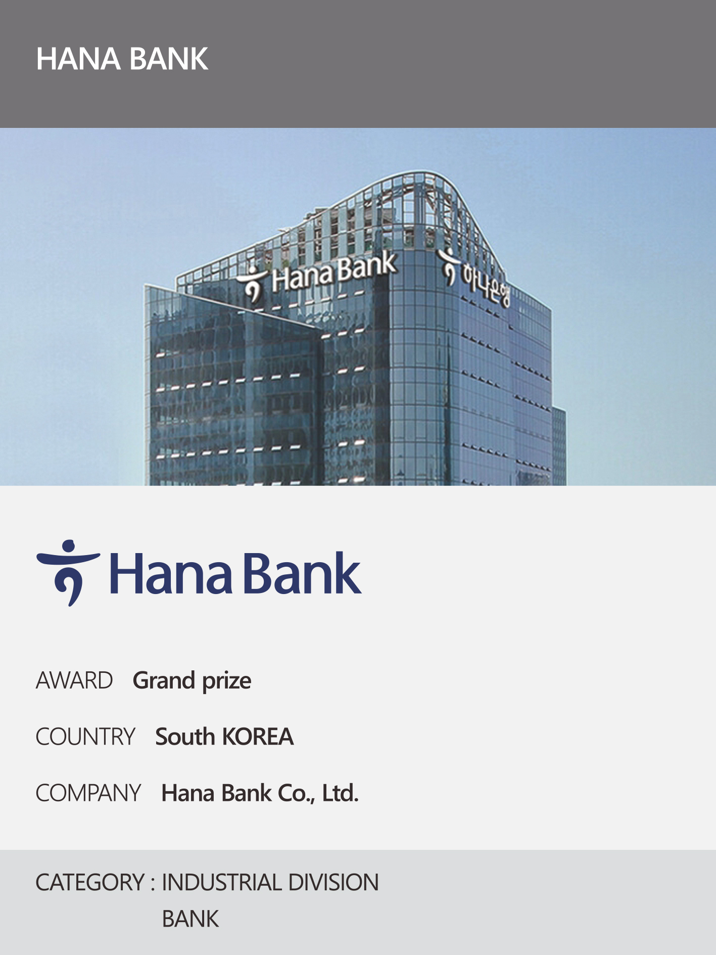 https://nyfknba.com/wp-content/uploads/2026/04/homepage_IL-9-1.jpg
1889
1417
nyfknba
https://nyfknba.com/wp-content/uploads/2025/11/nyf_logo1.svg
nyfknba2026-04-08 13:06:402026-04-09 15:24:30HANA BANK
https://nyfknba.com/wp-content/uploads/2026/04/homepage_IL-9-1.jpg
1889
1417
nyfknba
https://nyfknba.com/wp-content/uploads/2025/11/nyf_logo1.svg
nyfknba2026-04-08 13:06:402026-04-09 15:24:30HANA BANK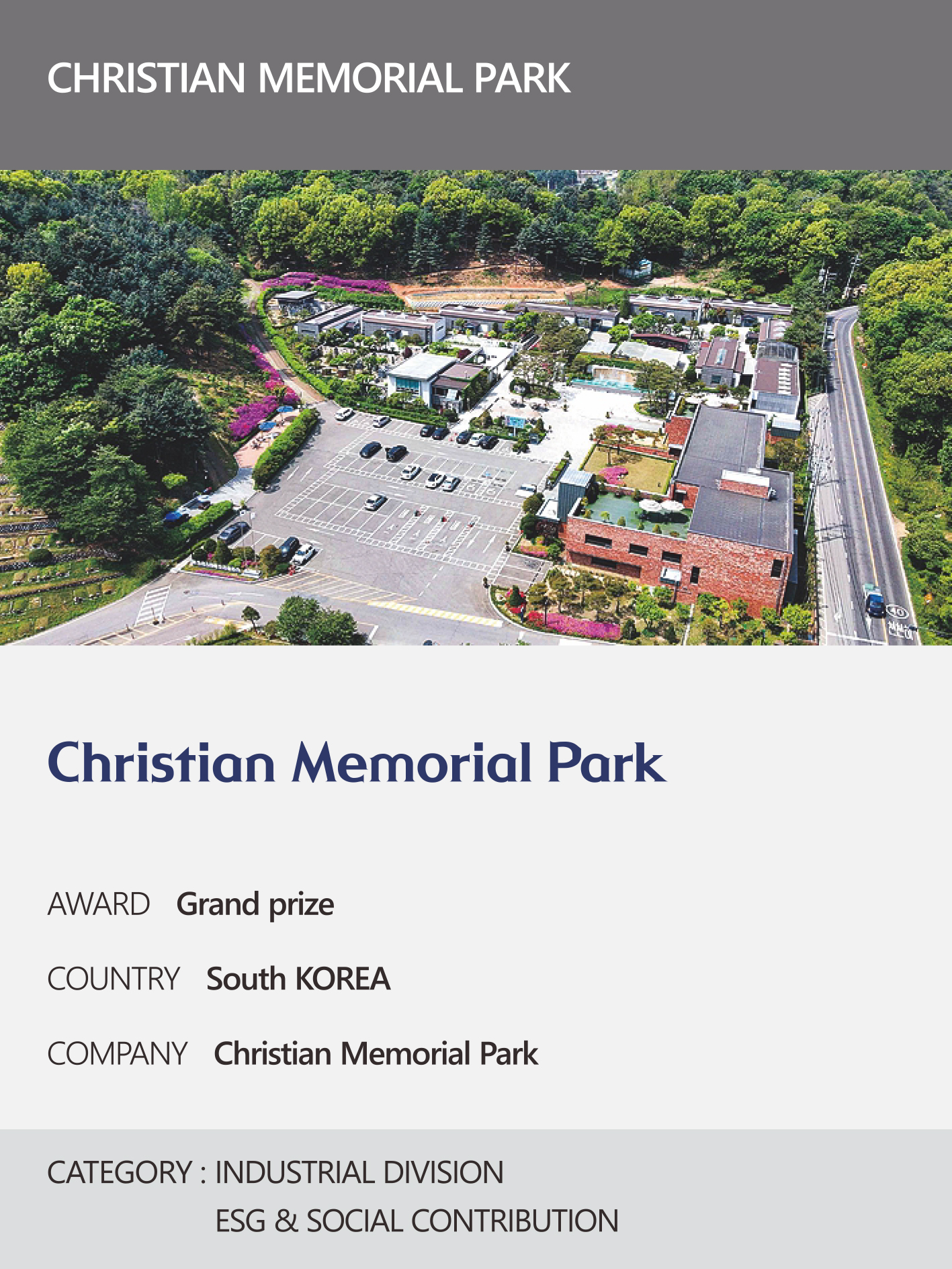 https://nyfknba.com/wp-content/uploads/2026/04/homepage_IL-8-1.jpg
1889
1417
nyfknba
https://nyfknba.com/wp-content/uploads/2025/11/nyf_logo1.svg
nyfknba2026-04-08 13:05:472026-04-09 15:20:39CHRISTIAN MEMORIAL PARK
https://nyfknba.com/wp-content/uploads/2026/04/homepage_IL-8-1.jpg
1889
1417
nyfknba
https://nyfknba.com/wp-content/uploads/2025/11/nyf_logo1.svg
nyfknba2026-04-08 13:05:472026-04-09 15:20:39CHRISTIAN MEMORIAL PARK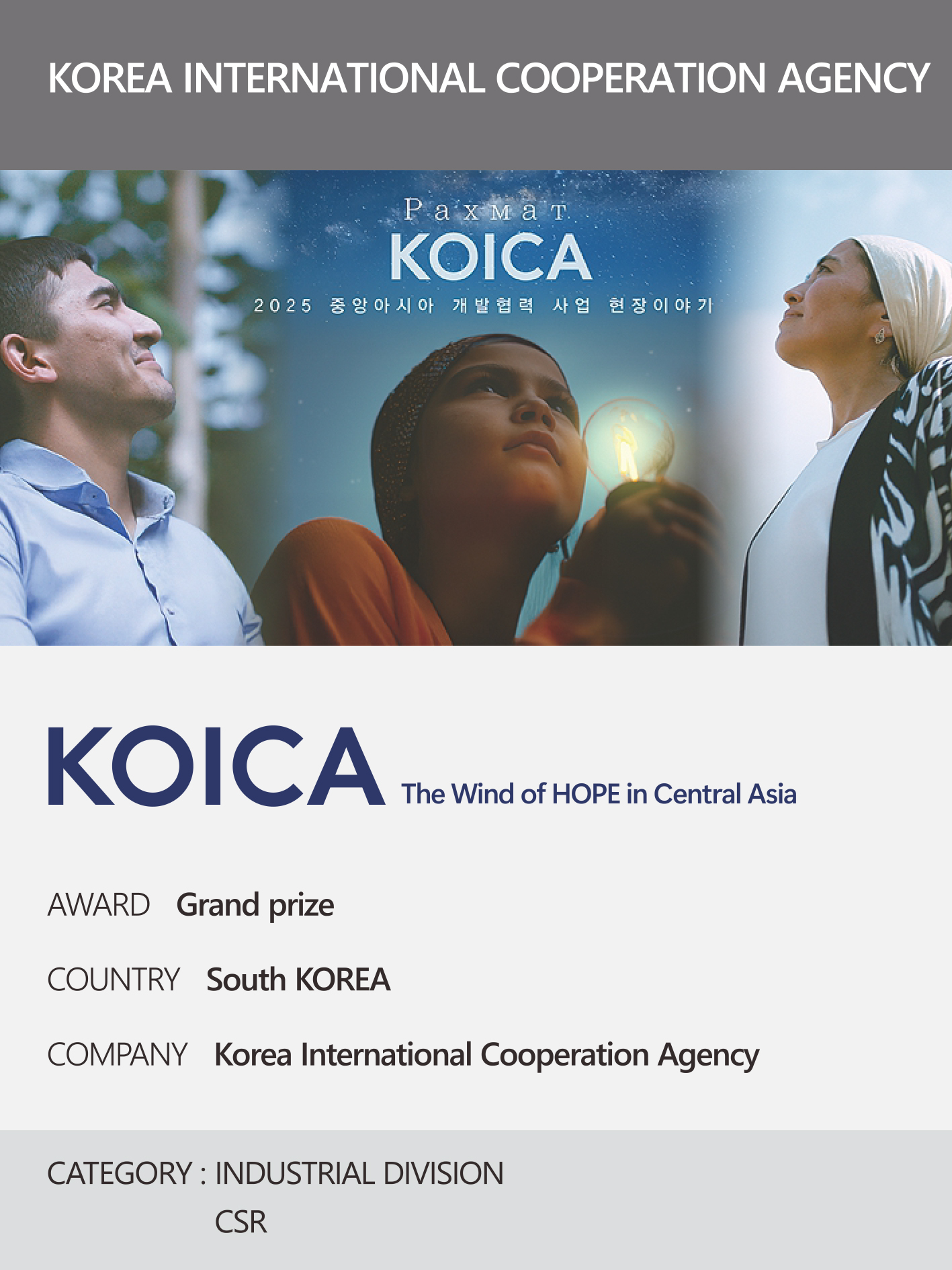 https://nyfknba.com/wp-content/uploads/2026/04/homepage_IL-7-1.jpg
1889
1417
nyfknba
https://nyfknba.com/wp-content/uploads/2025/11/nyf_logo1.svg
nyfknba2026-04-08 13:04:422026-04-09 15:17:30KOREA INTERNATIONAL COOPERATION AGENCY
https://nyfknba.com/wp-content/uploads/2026/04/homepage_IL-7-1.jpg
1889
1417
nyfknba
https://nyfknba.com/wp-content/uploads/2025/11/nyf_logo1.svg
nyfknba2026-04-08 13:04:422026-04-09 15:17:30KOREA INTERNATIONAL COOPERATION AGENCY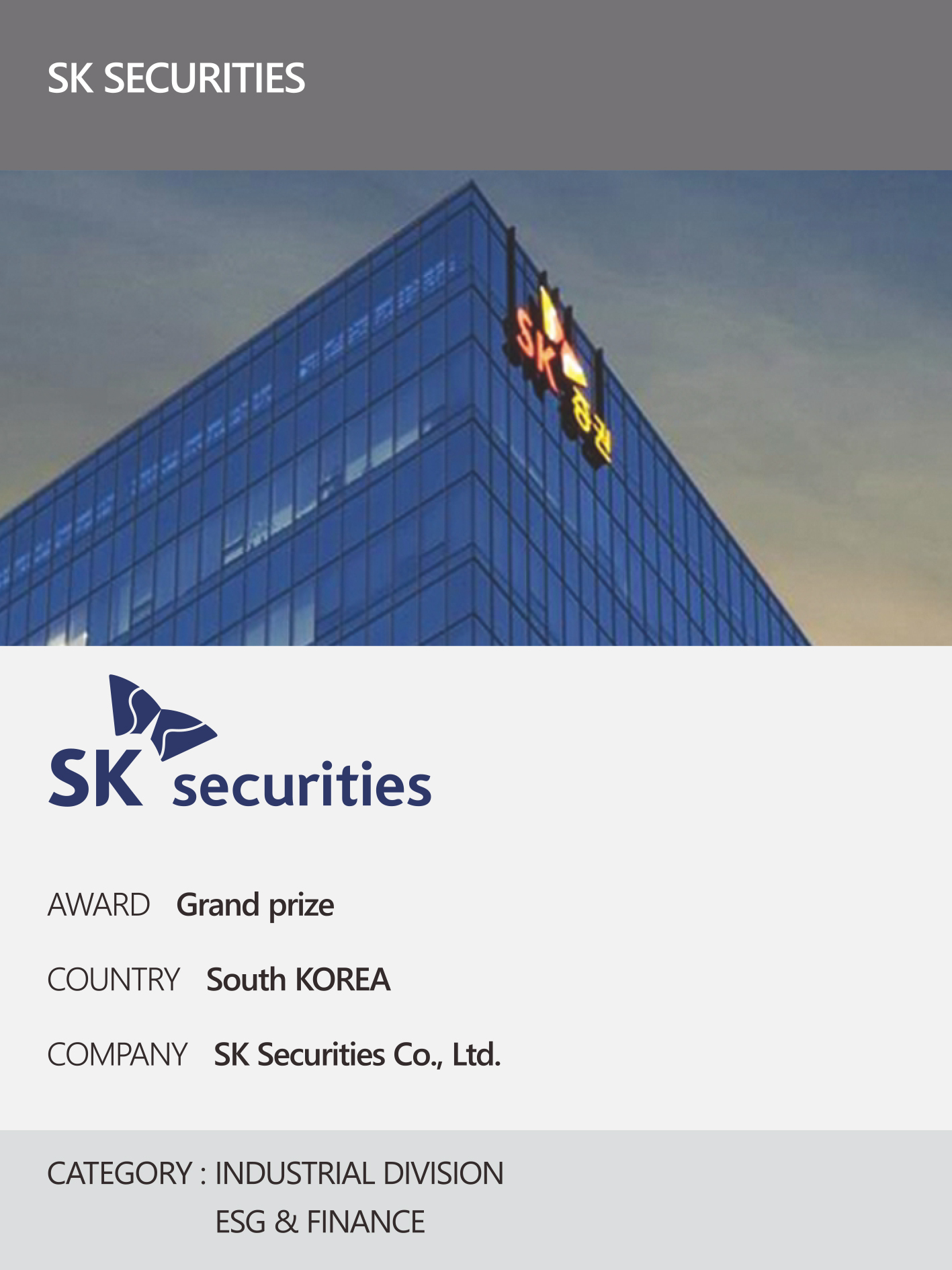 https://nyfknba.com/wp-content/uploads/2026/04/homepage_IL-6-1.jpg
1889
1417
nyfknba
https://nyfknba.com/wp-content/uploads/2025/11/nyf_logo1.svg
nyfknba2026-04-08 13:03:562026-04-09 15:14:02SK SECURITIES
https://nyfknba.com/wp-content/uploads/2026/04/homepage_IL-6-1.jpg
1889
1417
nyfknba
https://nyfknba.com/wp-content/uploads/2025/11/nyf_logo1.svg
nyfknba2026-04-08 13:03:562026-04-09 15:14:02SK SECURITIES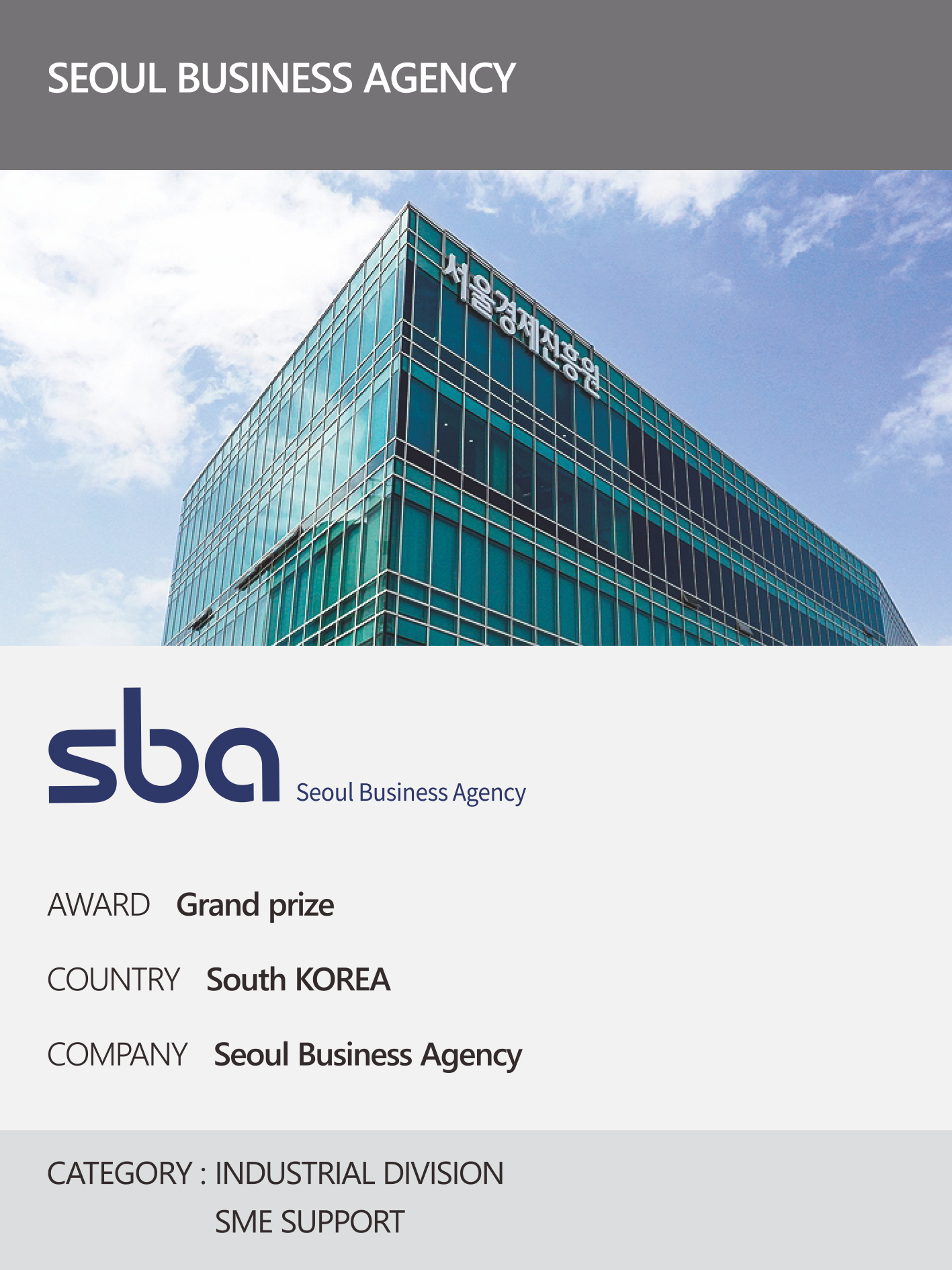 https://nyfknba.com/wp-content/uploads/2026/04/homepage_IL-5-1.jpg
1889
1417
nyfknba
https://nyfknba.com/wp-content/uploads/2025/11/nyf_logo1.svg
nyfknba2026-04-08 13:02:492026-04-09 15:10:44SEOUL BUSINESS AGENCY
https://nyfknba.com/wp-content/uploads/2026/04/homepage_IL-5-1.jpg
1889
1417
nyfknba
https://nyfknba.com/wp-content/uploads/2025/11/nyf_logo1.svg
nyfknba2026-04-08 13:02:492026-04-09 15:10:44SEOUL BUSINESS AGENCY https://nyfknba.com/wp-content/uploads/2026/04/homepage_IL-4-1.jpg
1889
1417
nyfknba
https://nyfknba.com/wp-content/uploads/2025/11/nyf_logo1.svg
nyfknba2026-04-08 13:01:382026-04-09 15:05:07SEEGENE MEDICAL FOUNDATION
https://nyfknba.com/wp-content/uploads/2026/04/homepage_IL-4-1.jpg
1889
1417
nyfknba
https://nyfknba.com/wp-content/uploads/2025/11/nyf_logo1.svg
nyfknba2026-04-08 13:01:382026-04-09 15:05:07SEEGENE MEDICAL FOUNDATION https://nyfknba.com/wp-content/uploads/2026/04/homepage_IL-3-1.jpg
1889
1417
nyfknba
https://nyfknba.com/wp-content/uploads/2025/11/nyf_logo1.svg
nyfknba2026-04-08 13:00:382026-04-09 14:59:46HANJIN
https://nyfknba.com/wp-content/uploads/2026/04/homepage_IL-3-1.jpg
1889
1417
nyfknba
https://nyfknba.com/wp-content/uploads/2025/11/nyf_logo1.svg
nyfknba2026-04-08 13:00:382026-04-09 14:59:46HANJIN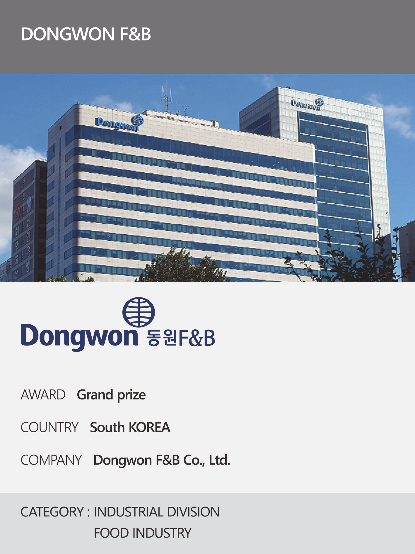 https://nyfknba.com/wp-content/uploads/2026/04/homepage_IL-2-1.jpg
1889
1417
nyfknba
https://nyfknba.com/wp-content/uploads/2025/11/nyf_logo1.svg
nyfknba2026-04-08 12:59:502026-04-09 14:54:54DONGWON F&B
https://nyfknba.com/wp-content/uploads/2026/04/homepage_IL-2-1.jpg
1889
1417
nyfknba
https://nyfknba.com/wp-content/uploads/2025/11/nyf_logo1.svg
nyfknba2026-04-08 12:59:502026-04-09 14:54:54DONGWON F&B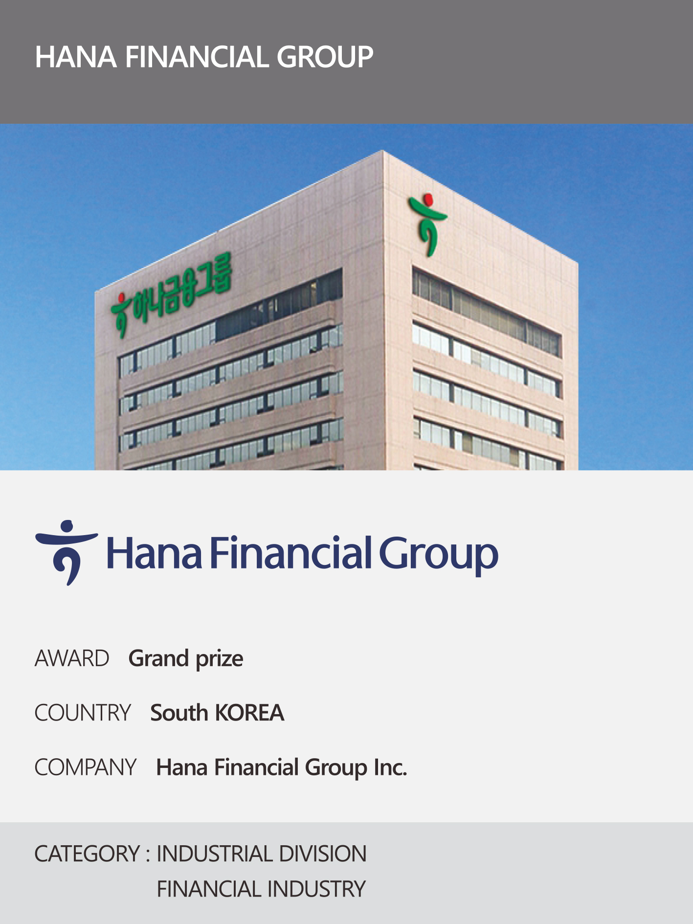 https://nyfknba.com/wp-content/uploads/2026/04/homepage_IL-1-1.jpg
1889
1417
nyfknba
https://nyfknba.com/wp-content/uploads/2025/11/nyf_logo1.svg
nyfknba2026-04-08 12:59:012026-04-09 14:47:57HANA FINANCIAL GROUPCHEONGJU, BUSINESS-FRIENDLY CITY
https://nyfknba.com/wp-content/uploads/2026/04/homepage_IL-1-1.jpg
1889
1417
nyfknba
https://nyfknba.com/wp-content/uploads/2025/11/nyf_logo1.svg
nyfknba2026-04-08 12:59:012026-04-09 14:47:57HANA FINANCIAL GROUPCHEONGJU, BUSINESS-FRIENDLY CITY