WINNERS GALLERY
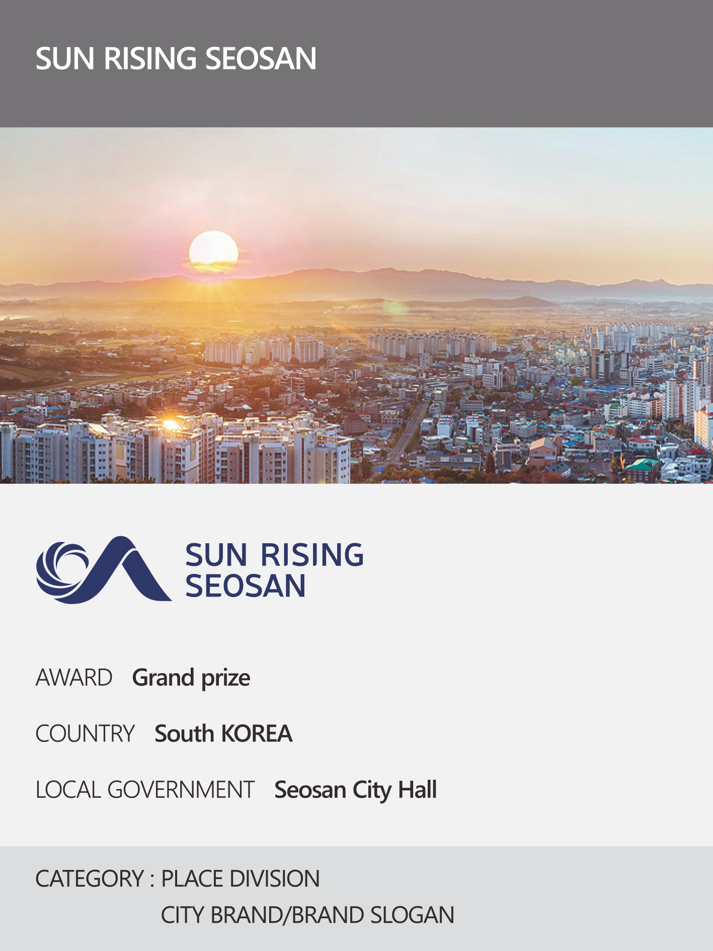
This year’s 17th edition of the event, hosted by the New York Festival, one of the world’s top three advertising festivals, annually recognizes and honors Korea’s top brand.
According to the New York Festival’s announcement, Haetuseosan was ranked as the top city brand slogan (BI) in Korea, achieving the highest ratings in brand image power, quality competitiveness, global competitiveness, and overall favorability, and securing the top spot in NCI.
In 2015, the city’s symbolic committee selected the brand slogan “Seosan Rising” – which embodies the city’s aspirations for growth, progress, and advancement – and it was officially implemented in February 2016 after being approved by the Seosan City Council. The brand combines its brand mark, which embodies the rising sun and the pristine land, sea, and sky in seven distinct units, with its brand characters, Haenuri and Hannari, as a unified brand identity.
The brand design embodies the essence of Seosan, a city where citizens thrive, by combining the letter “S” from Seosan with the image of a wave rising from the sun, symbolizing the city’s growth into a thriving logistics hub on the west coast.
Furthermore, the English letter “S” in the center represents Seosan’s global ambitions to spread its influence worldwide. The logo’s color palette is symbolic: red represents the bold and adventurous Seosan, blue-violet represents cutting-edge industries, and the combination of blue and green evokes a sense of serene natural beauty.
This award is significant because ‘Sunrise Seosan’ has not only earned recognition from domestic consumers but also from a global evaluation system, demonstrating its competitiveness.
An official from Seosan City stated that they plan to build on this achievement by leveraging a brand that embodies the city’s identity and vision for the future to further enhance its value.
 https://nyfknba.com/wp-content/uploads/2026/04/homepage_PL-15.jpg
1889
1417
nyfknba
https://nyfknba.com/wp-content/uploads/2025/11/nyf_logo1.svg
nyfknba2026-04-09 19:14:082026-04-09 19:14:54ULJIN SNOW CRAB Interview 2026
https://nyfknba.com/wp-content/uploads/2026/04/homepage_PL-15.jpg
1889
1417
nyfknba
https://nyfknba.com/wp-content/uploads/2025/11/nyf_logo1.svg
nyfknba2026-04-09 19:14:082026-04-09 19:14:54ULJIN SNOW CRAB Interview 2026 https://nyfknba.com/wp-content/uploads/2026/04/homepage_PL-14.jpg
1889
1417
nyfknba
https://nyfknba.com/wp-content/uploads/2025/11/nyf_logo1.svg
nyfknba2026-04-09 19:03:362026-04-10 15:19:05GOODTRAE WATERMELONS Interview 2026
https://nyfknba.com/wp-content/uploads/2026/04/homepage_PL-14.jpg
1889
1417
nyfknba
https://nyfknba.com/wp-content/uploads/2025/11/nyf_logo1.svg
nyfknba2026-04-09 19:03:362026-04-10 15:19:05GOODTRAE WATERMELONS Interview 2026 https://nyfknba.com/wp-content/uploads/2026/04/homepage_PL-13.jpg
1889
1417
nyfknba
https://nyfknba.com/wp-content/uploads/2025/11/nyf_logo1.svg
nyfknba2026-04-09 18:59:592026-04-09 18:59:59GOESAN CLEAN RED PEPPER Interview 2026
https://nyfknba.com/wp-content/uploads/2026/04/homepage_PL-13.jpg
1889
1417
nyfknba
https://nyfknba.com/wp-content/uploads/2025/11/nyf_logo1.svg
nyfknba2026-04-09 18:59:592026-04-09 18:59:59GOESAN CLEAN RED PEPPER Interview 2026 https://nyfknba.com/wp-content/uploads/2026/04/homepage_PL-12.jpg
1889
1417
nyfknba
https://nyfknba.com/wp-content/uploads/2025/11/nyf_logo1.svg
nyfknba2026-04-09 18:55:412026-04-09 18:55:41IMGEUMNIMPYO ICHEON HANWOO Interview 2026
https://nyfknba.com/wp-content/uploads/2026/04/homepage_PL-12.jpg
1889
1417
nyfknba
https://nyfknba.com/wp-content/uploads/2025/11/nyf_logo1.svg
nyfknba2026-04-09 18:55:412026-04-09 18:55:41IMGEUMNIMPYO ICHEON HANWOO Interview 2026 https://nyfknba.com/wp-content/uploads/2026/04/homepage_PL-11.jpg
1889
1417
nyfknba
https://nyfknba.com/wp-content/uploads/2025/11/nyf_logo1.svg
nyfknba2026-04-09 18:50:192026-04-09 18:51:11IMGEUMNIMPYO ICHEON RICE Interview 2026
https://nyfknba.com/wp-content/uploads/2026/04/homepage_PL-11.jpg
1889
1417
nyfknba
https://nyfknba.com/wp-content/uploads/2025/11/nyf_logo1.svg
nyfknba2026-04-09 18:50:192026-04-09 18:51:11IMGEUMNIMPYO ICHEON RICE Interview 2026 https://nyfknba.com/wp-content/uploads/2026/04/homepage_PL-10.jpg
1889
1417
nyfknba
https://nyfknba.com/wp-content/uploads/2025/11/nyf_logo1.svg
nyfknba2026-04-09 18:46:382026-04-09 18:47:51SUNPLUS Interview 2026
https://nyfknba.com/wp-content/uploads/2026/04/homepage_PL-10.jpg
1889
1417
nyfknba
https://nyfknba.com/wp-content/uploads/2025/11/nyf_logo1.svg
nyfknba2026-04-09 18:46:382026-04-09 18:47:51SUNPLUS Interview 2026 https://nyfknba.com/wp-content/uploads/2026/04/homepage_PL-9.jpg
1889
1417
nyfknba
https://nyfknba.com/wp-content/uploads/2025/11/nyf_logo1.svg
nyfknba2026-04-09 18:43:442026-04-10 15:15:03GOODTRAE Interview 2026
https://nyfknba.com/wp-content/uploads/2026/04/homepage_PL-9.jpg
1889
1417
nyfknba
https://nyfknba.com/wp-content/uploads/2025/11/nyf_logo1.svg
nyfknba2026-04-09 18:43:442026-04-10 15:15:03GOODTRAE Interview 2026 https://nyfknba.com/wp-content/uploads/2026/04/homepage_PL-8.jpg
1889
1417
nyfknba
https://nyfknba.com/wp-content/uploads/2025/11/nyf_logo1.svg
nyfknba2026-04-09 18:39:372026-04-09 18:41:22INCHEON HANEULSOO Interview 2026
https://nyfknba.com/wp-content/uploads/2026/04/homepage_PL-8.jpg
1889
1417
nyfknba
https://nyfknba.com/wp-content/uploads/2025/11/nyf_logo1.svg
nyfknba2026-04-09 18:39:372026-04-09 18:41:22INCHEON HANEULSOO Interview 2026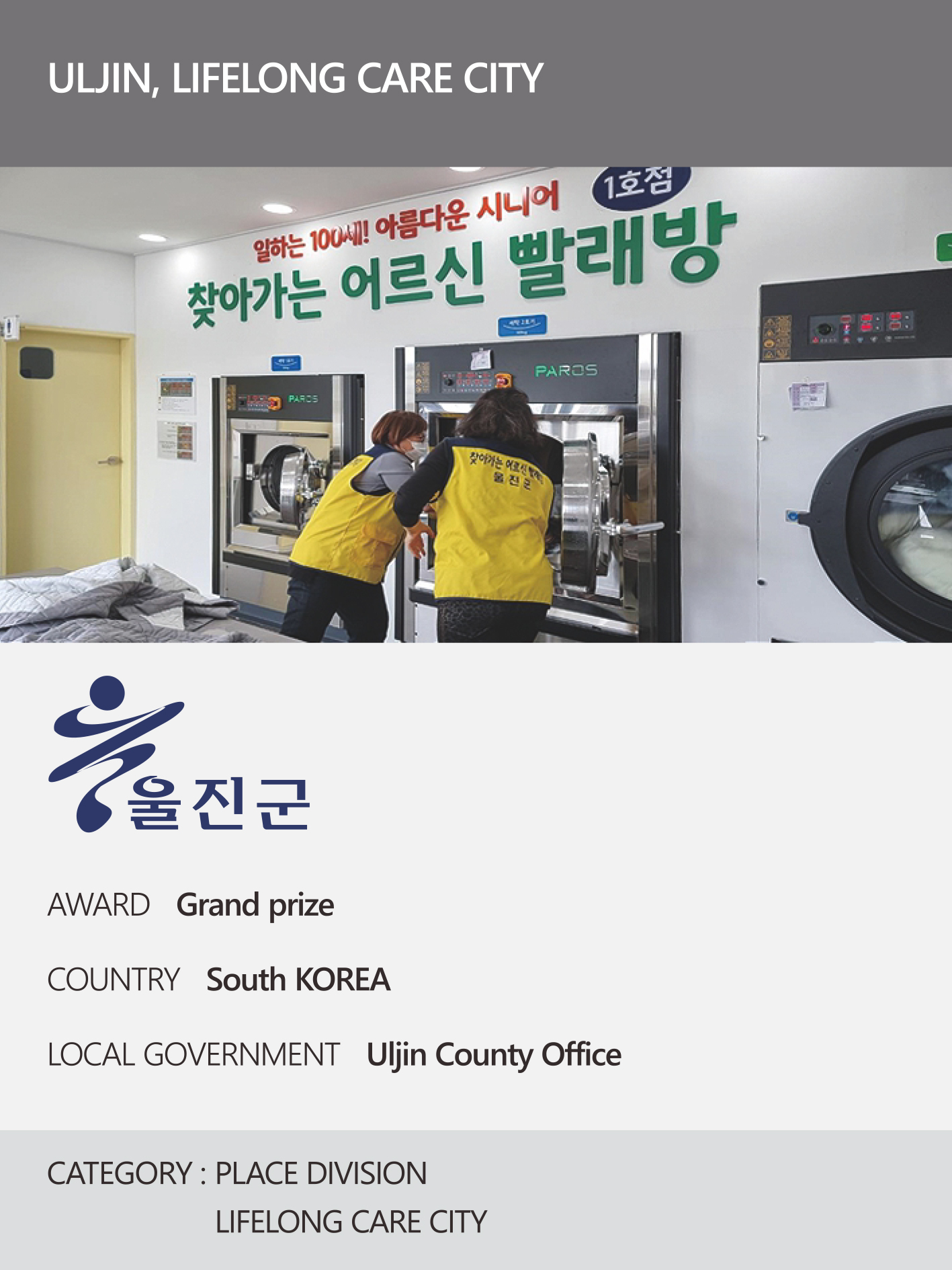 https://nyfknba.com/wp-content/uploads/2026/04/homepage_PL-7.jpg
1889
1417
nyfknba
https://nyfknba.com/wp-content/uploads/2025/11/nyf_logo1.svg
nyfknba2026-04-09 18:35:022026-04-09 18:38:11ULJIN, LIFELONG CARE CITY Interview 2026
https://nyfknba.com/wp-content/uploads/2026/04/homepage_PL-7.jpg
1889
1417
nyfknba
https://nyfknba.com/wp-content/uploads/2025/11/nyf_logo1.svg
nyfknba2026-04-09 18:35:022026-04-09 18:38:11ULJIN, LIFELONG CARE CITY Interview 2026 https://nyfknba.com/wp-content/uploads/2026/04/homepage_PL-6.jpg
1889
1417
nyfknba
https://nyfknba.com/wp-content/uploads/2025/11/nyf_logo1.svg
nyfknba2026-04-09 18:27:362026-04-09 18:27:36GOESAN, ECO-FRIENDLY ORGANIC FARMING CITY Interview 2026
https://nyfknba.com/wp-content/uploads/2026/04/homepage_PL-6.jpg
1889
1417
nyfknba
https://nyfknba.com/wp-content/uploads/2025/11/nyf_logo1.svg
nyfknba2026-04-09 18:27:362026-04-09 18:27:36GOESAN, ECO-FRIENDLY ORGANIC FARMING CITY Interview 2026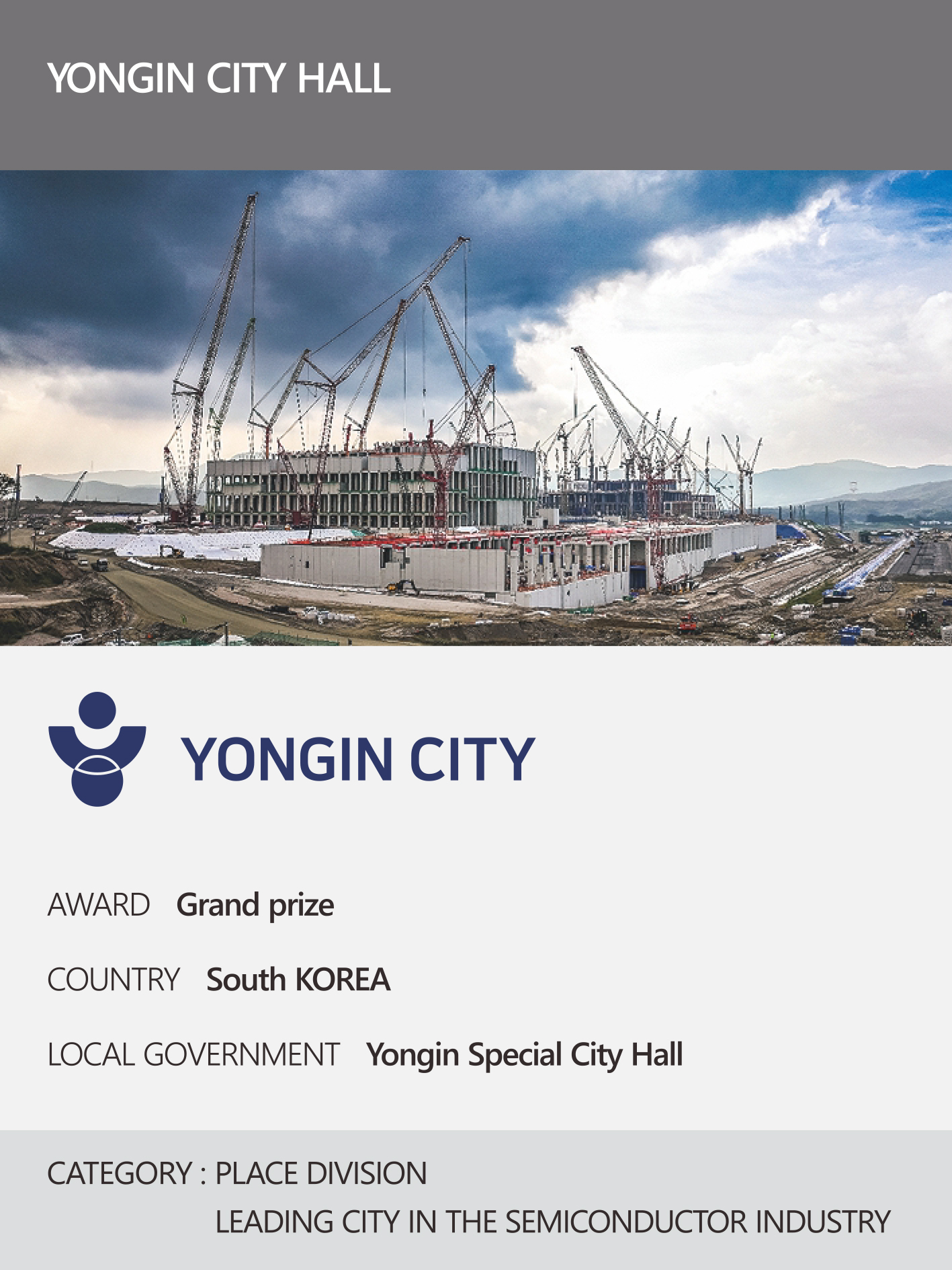 https://nyfknba.com/wp-content/uploads/2026/04/homepage_PL-5.jpg
1889
1417
nyfknba
https://nyfknba.com/wp-content/uploads/2025/11/nyf_logo1.svg
nyfknba2026-04-09 18:19:152026-04-09 18:19:15YONGIN CITY HALL Interview 2026
https://nyfknba.com/wp-content/uploads/2026/04/homepage_PL-5.jpg
1889
1417
nyfknba
https://nyfknba.com/wp-content/uploads/2025/11/nyf_logo1.svg
nyfknba2026-04-09 18:19:152026-04-09 18:19:15YONGIN CITY HALL Interview 2026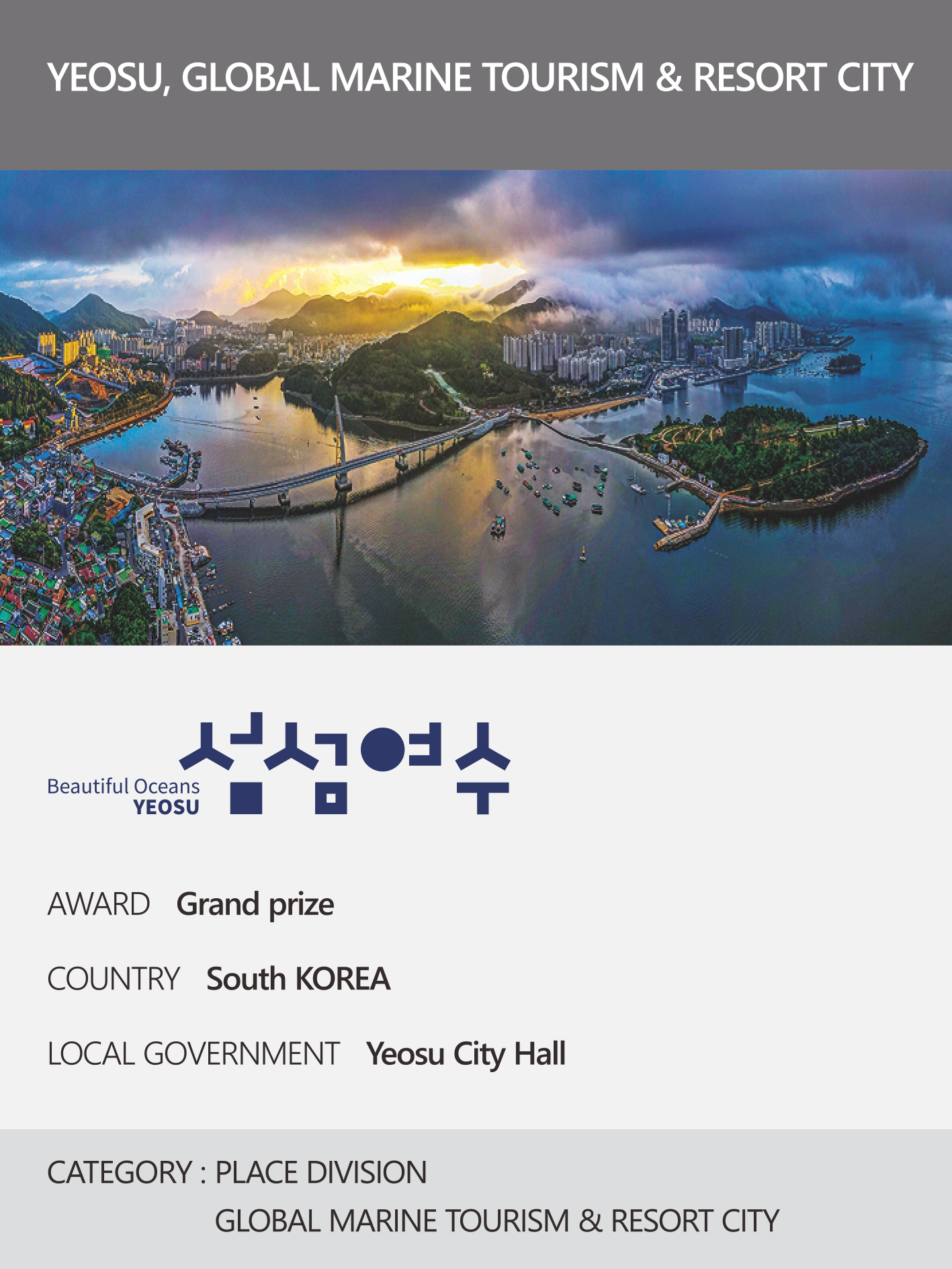 https://nyfknba.com/wp-content/uploads/2026/04/homepage_PL-4.jpg
1889
1417
nyfknba
https://nyfknba.com/wp-content/uploads/2025/11/nyf_logo1.svg
nyfknba2026-04-09 18:13:372026-04-09 18:13:37YEOSU, GLOBAL MARINE TOURISM & RESORT CITY Interview 2026
https://nyfknba.com/wp-content/uploads/2026/04/homepage_PL-4.jpg
1889
1417
nyfknba
https://nyfknba.com/wp-content/uploads/2025/11/nyf_logo1.svg
nyfknba2026-04-09 18:13:372026-04-09 18:13:37YEOSU, GLOBAL MARINE TOURISM & RESORT CITY Interview 2026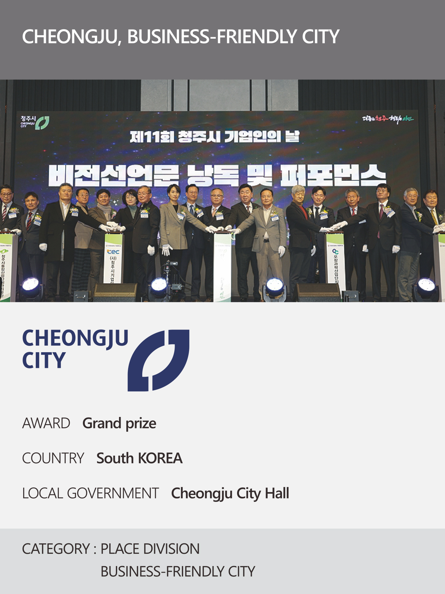 https://nyfknba.com/wp-content/uploads/2026/04/homepage_PL-3.jpg
1889
1417
nyfknba
https://nyfknba.com/wp-content/uploads/2025/11/nyf_logo1.svg
nyfknba2026-04-09 18:10:492026-04-09 18:10:49CHEONGJU, BUSINESS-FRIENDLY CITY Interview 2026
https://nyfknba.com/wp-content/uploads/2026/04/homepage_PL-2.jpg
1889
1417
nyfknba
https://nyfknba.com/wp-content/uploads/2025/11/nyf_logo1.svg
nyfknba2026-04-09 18:06:322026-04-10 15:07:06SUN RIGING SEOSAN Interview 2026
https://nyfknba.com/wp-content/uploads/2026/04/homepage_PL-3.jpg
1889
1417
nyfknba
https://nyfknba.com/wp-content/uploads/2025/11/nyf_logo1.svg
nyfknba2026-04-09 18:10:492026-04-09 18:10:49CHEONGJU, BUSINESS-FRIENDLY CITY Interview 2026
https://nyfknba.com/wp-content/uploads/2026/04/homepage_PL-2.jpg
1889
1417
nyfknba
https://nyfknba.com/wp-content/uploads/2025/11/nyf_logo1.svg
nyfknba2026-04-09 18:06:322026-04-10 15:07:06SUN RIGING SEOSAN Interview 2026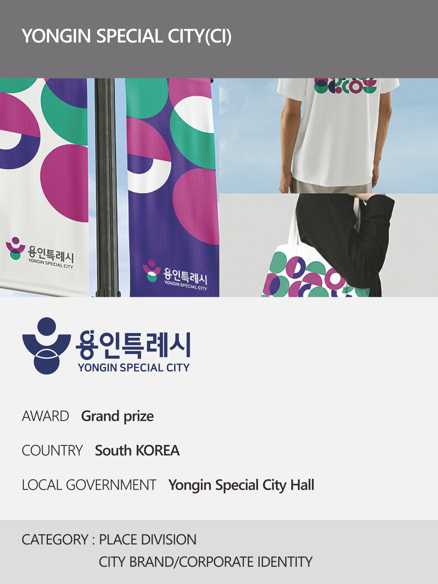 https://nyfknba.com/wp-content/uploads/2026/04/homepage_PL-교체-3건-1.jpg
1890
1417
nyfknba
https://nyfknba.com/wp-content/uploads/2025/11/nyf_logo1.svg
nyfknba2026-04-09 18:02:312026-04-10 15:03:01YONGIN SPECIAL CITY HALL Interview 2026
https://nyfknba.com/wp-content/uploads/2026/04/homepage_PL-교체-3건-1.jpg
1890
1417
nyfknba
https://nyfknba.com/wp-content/uploads/2025/11/nyf_logo1.svg
nyfknba2026-04-09 18:02:312026-04-10 15:03:01YONGIN SPECIAL CITY HALL Interview 2026 https://nyfknba.com/wp-content/uploads/2026/04/homepage_IL-40-2.jpg
1889
1417
nyfknba
https://nyfknba.com/wp-content/uploads/2025/11/nyf_logo1.svg
nyfknba2026-04-09 17:58:582026-04-09 17:59:52LOCK&LOCK Interview 2026
https://nyfknba.com/wp-content/uploads/2026/04/homepage_IL-40-2.jpg
1889
1417
nyfknba
https://nyfknba.com/wp-content/uploads/2025/11/nyf_logo1.svg
nyfknba2026-04-09 17:58:582026-04-09 17:59:52LOCK&LOCK Interview 2026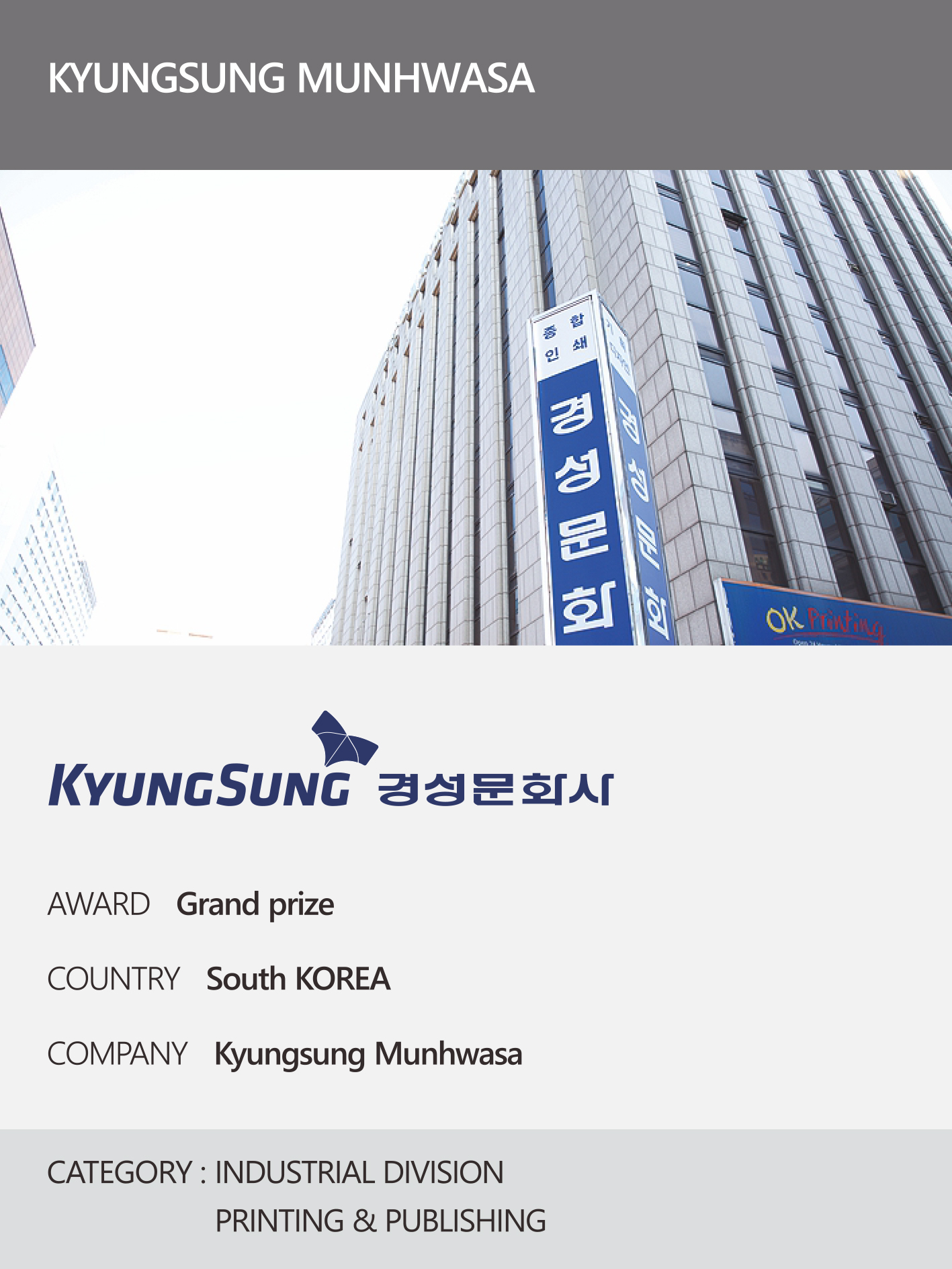 https://nyfknba.com/wp-content/uploads/2026/04/homepage_IL-38-2.jpg
1889
1417
nyfknba
https://nyfknba.com/wp-content/uploads/2025/11/nyf_logo1.svg
nyfknba2026-04-09 17:53:592026-04-09 17:53:59KYUNGSUNG MUNHWASA Interview 2026
https://nyfknba.com/wp-content/uploads/2026/04/homepage_IL-38-2.jpg
1889
1417
nyfknba
https://nyfknba.com/wp-content/uploads/2025/11/nyf_logo1.svg
nyfknba2026-04-09 17:53:592026-04-09 17:53:59KYUNGSUNG MUNHWASA Interview 2026 https://nyfknba.com/wp-content/uploads/2026/04/homepage_IL-37-1.jpg
1889
1417
nyfknba
https://nyfknba.com/wp-content/uploads/2025/11/nyf_logo1.svg
nyfknba2026-04-09 17:49:592026-04-09 17:50:29WOONGJIN PREEDLIFE Interview 2026
https://nyfknba.com/wp-content/uploads/2026/04/homepage_IL-37-1.jpg
1889
1417
nyfknba
https://nyfknba.com/wp-content/uploads/2025/11/nyf_logo1.svg
nyfknba2026-04-09 17:49:592026-04-09 17:50:29WOONGJIN PREEDLIFE Interview 2026 https://nyfknba.com/wp-content/uploads/2026/04/homepage_IL-36-1.jpg
1889
1417
nyfknba
https://nyfknba.com/wp-content/uploads/2025/11/nyf_logo1.svg
nyfknba2026-04-09 17:46:462026-04-09 17:46:46HANATOUR Interview 2026
https://nyfknba.com/wp-content/uploads/2026/04/homepage_IL-36-1.jpg
1889
1417
nyfknba
https://nyfknba.com/wp-content/uploads/2025/11/nyf_logo1.svg
nyfknba2026-04-09 17:46:462026-04-09 17:46:46HANATOUR Interview 2026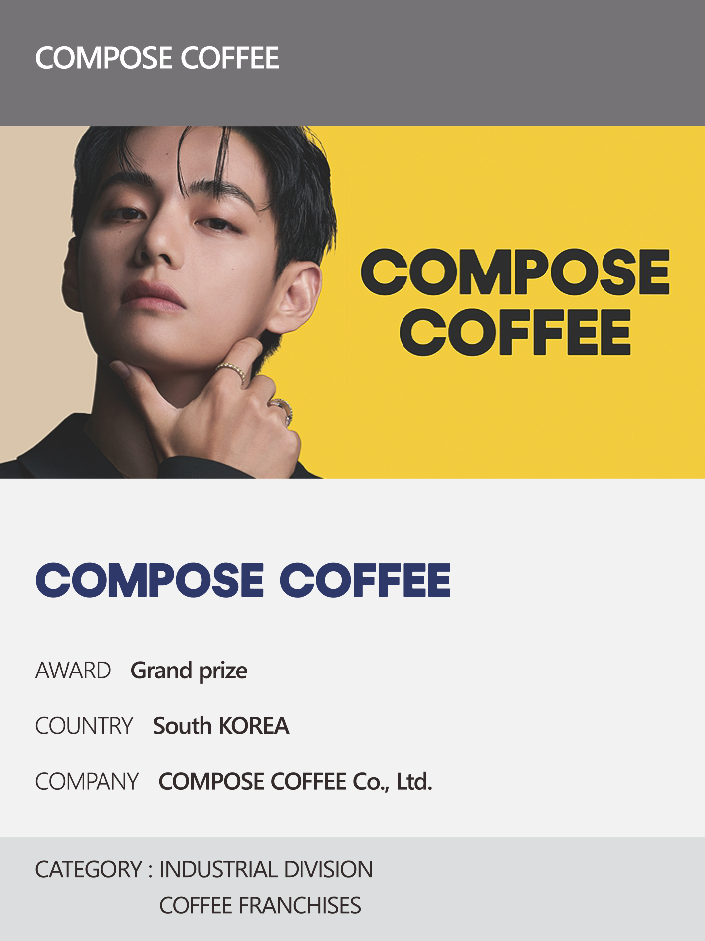 https://nyfknba.com/wp-content/uploads/2026/04/homepage_IL-35-1.jpg
1889
1417
nyfknba
https://nyfknba.com/wp-content/uploads/2025/11/nyf_logo1.svg
nyfknba2026-04-09 17:43:422026-04-09 17:44:46COMPOSE COFFEE Interview 2026
https://nyfknba.com/wp-content/uploads/2026/04/homepage_IL-35-1.jpg
1889
1417
nyfknba
https://nyfknba.com/wp-content/uploads/2025/11/nyf_logo1.svg
nyfknba2026-04-09 17:43:422026-04-09 17:44:46COMPOSE COFFEE Interview 2026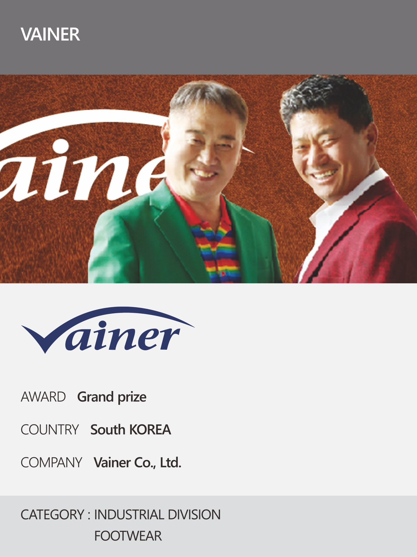 https://nyfknba.com/wp-content/uploads/2026/04/homepage_IL-34-1.jpg
1889
1417
nyfknba
https://nyfknba.com/wp-content/uploads/2025/11/nyf_logo1.svg
nyfknba2026-04-09 17:35:242026-04-09 17:35:24VAINER Interview 2026
https://nyfknba.com/wp-content/uploads/2026/04/homepage_IL-34-1.jpg
1889
1417
nyfknba
https://nyfknba.com/wp-content/uploads/2025/11/nyf_logo1.svg
nyfknba2026-04-09 17:35:242026-04-09 17:35:24VAINER Interview 2026 https://nyfknba.com/wp-content/uploads/2026/04/homepage_IL-33-2.jpg
1889
1417
nyfknba
https://nyfknba.com/wp-content/uploads/2025/11/nyf_logo1.svg
nyfknba2026-04-09 17:32:242026-04-09 17:33:58SIWONSCHOOL Interview 2026
https://nyfknba.com/wp-content/uploads/2026/04/homepage_IL-33-2.jpg
1889
1417
nyfknba
https://nyfknba.com/wp-content/uploads/2025/11/nyf_logo1.svg
nyfknba2026-04-09 17:32:242026-04-09 17:33:58SIWONSCHOOL Interview 2026 https://nyfknba.com/wp-content/uploads/2026/04/homepage_IL-31-1.jpg
1889
1417
nyfknba
https://nyfknba.com/wp-content/uploads/2025/11/nyf_logo1.svg
nyfknba2026-04-09 17:14:232026-04-09 17:15:34GOONGBE Interview 2026
https://nyfknba.com/wp-content/uploads/2026/04/homepage_IL-31-1.jpg
1889
1417
nyfknba
https://nyfknba.com/wp-content/uploads/2025/11/nyf_logo1.svg
nyfknba2026-04-09 17:14:232026-04-09 17:15:34GOONGBE Interview 2026 https://nyfknba.com/wp-content/uploads/2026/04/homepage_IL-30-1.jpg
1889
1417
nyfknba
https://nyfknba.com/wp-content/uploads/2025/11/nyf_logo1.svg
nyfknba2026-04-09 17:08:592026-04-09 17:09:47DAWN808 Interview 2026
https://nyfknba.com/wp-content/uploads/2026/04/homepage_IL-30-1.jpg
1889
1417
nyfknba
https://nyfknba.com/wp-content/uploads/2025/11/nyf_logo1.svg
nyfknba2026-04-09 17:08:592026-04-09 17:09:47DAWN808 Interview 2026 https://nyfknba.com/wp-content/uploads/2026/04/homepage_IL-29-1.jpg
1889
1417
nyfknba
https://nyfknba.com/wp-content/uploads/2025/11/nyf_logo1.svg
nyfknba2026-04-09 17:05:052026-04-09 17:06:25SAMJIN AMOOK Interview 2026
https://nyfknba.com/wp-content/uploads/2026/04/homepage_IL-29-1.jpg
1889
1417
nyfknba
https://nyfknba.com/wp-content/uploads/2025/11/nyf_logo1.svg
nyfknba2026-04-09 17:05:052026-04-09 17:06:25SAMJIN AMOOK Interview 2026 https://nyfknba.com/wp-content/uploads/2026/04/homepage_IL-28-1.jpg
1889
1417
nyfknba
https://nyfknba.com/wp-content/uploads/2025/11/nyf_logo1.svg
nyfknba2026-04-09 17:00:452026-04-09 17:02:00TERRA Interview 2026
https://nyfknba.com/wp-content/uploads/2026/04/homepage_IL-28-1.jpg
1889
1417
nyfknba
https://nyfknba.com/wp-content/uploads/2025/11/nyf_logo1.svg
nyfknba2026-04-09 17:00:452026-04-09 17:02:00TERRA Interview 2026 https://nyfknba.com/wp-content/uploads/2026/04/homepage_IL-27-1.jpg
1889
1417
nyfknba
https://nyfknba.com/wp-content/uploads/2025/11/nyf_logo1.svg
nyfknba2026-04-09 16:55:112026-04-09 16:55:52CHAMISUL Interview 2026
https://nyfknba.com/wp-content/uploads/2026/04/homepage_IL-27-1.jpg
1889
1417
nyfknba
https://nyfknba.com/wp-content/uploads/2025/11/nyf_logo1.svg
nyfknba2026-04-09 16:55:112026-04-09 16:55:52CHAMISUL Interview 2026 https://nyfknba.com/wp-content/uploads/2026/04/homepage_IL-25-1.jpg
1889
1417
nyfknba
https://nyfknba.com/wp-content/uploads/2025/11/nyf_logo1.svg
nyfknba2026-04-09 16:49:572026-04-09 16:50:29TOGETHER Interview 2026
https://nyfknba.com/wp-content/uploads/2026/04/homepage_IL-25-1.jpg
1889
1417
nyfknba
https://nyfknba.com/wp-content/uploads/2025/11/nyf_logo1.svg
nyfknba2026-04-09 16:49:572026-04-09 16:50:29TOGETHER Interview 2026 https://nyfknba.com/wp-content/uploads/2026/04/homepage_IL-23-1.jpg
1889
1417
nyfknba
https://nyfknba.com/wp-content/uploads/2025/11/nyf_logo1.svg
nyfknba2026-04-09 16:33:032026-04-09 16:47:44YANGBAN Interview 2026
https://nyfknba.com/wp-content/uploads/2026/04/homepage_IL-23-1.jpg
1889
1417
nyfknba
https://nyfknba.com/wp-content/uploads/2025/11/nyf_logo1.svg
nyfknba2026-04-09 16:33:032026-04-09 16:47:44YANGBAN Interview 2026 https://nyfknba.com/wp-content/uploads/2026/04/homepage_IL-24-1.jpg
1889
1417
nyfknba
https://nyfknba.com/wp-content/uploads/2025/11/nyf_logo1.svg
nyfknba2026-04-09 16:28:362026-04-09 16:31:13JONGGA Interview 2026
https://nyfknba.com/wp-content/uploads/2026/04/homepage_IL-24-1.jpg
1889
1417
nyfknba
https://nyfknba.com/wp-content/uploads/2025/11/nyf_logo1.svg
nyfknba2026-04-09 16:28:362026-04-09 16:31:13JONGGA Interview 2026 https://nyfknba.com/wp-content/uploads/2026/04/homepage_IL-22-1.jpg
1889
1417
nyfknba
https://nyfknba.com/wp-content/uploads/2025/11/nyf_logo1.svg
nyfknba2026-04-09 16:21:582026-04-09 16:26:10DENMARK HEJ! Interview 2026
https://nyfknba.com/wp-content/uploads/2026/04/homepage_IL-22-1.jpg
1889
1417
nyfknba
https://nyfknba.com/wp-content/uploads/2025/11/nyf_logo1.svg
nyfknba2026-04-09 16:21:582026-04-09 16:26:10DENMARK HEJ! Interview 2026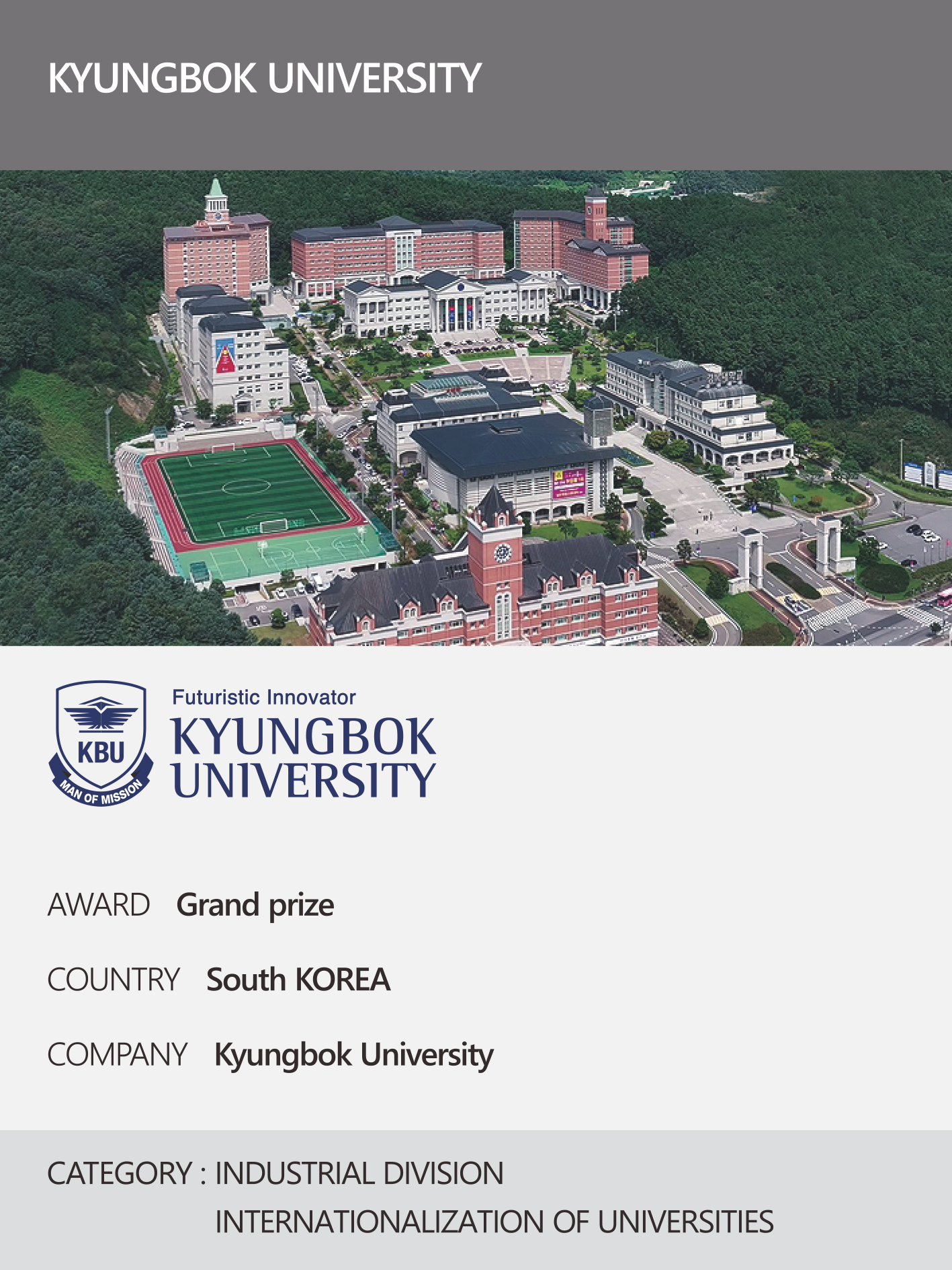 https://nyfknba.com/wp-content/uploads/2026/04/homepage_IL-21-1.jpg
1889
1417
nyfknba
https://nyfknba.com/wp-content/uploads/2025/11/nyf_logo1.svg
nyfknba2026-04-09 16:16:592026-04-10 09:19:21KYUNGBOK UNIVERSITY Interview 2026
https://nyfknba.com/wp-content/uploads/2026/04/homepage_IL-21-1.jpg
1889
1417
nyfknba
https://nyfknba.com/wp-content/uploads/2025/11/nyf_logo1.svg
nyfknba2026-04-09 16:16:592026-04-10 09:19:21KYUNGBOK UNIVERSITY Interview 2026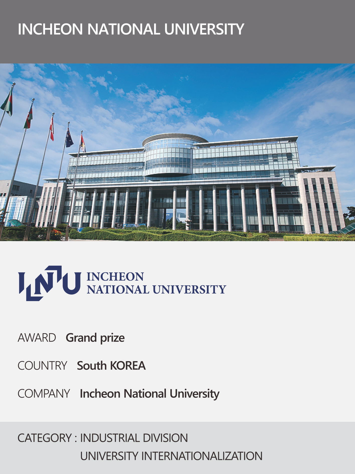 https://nyfknba.com/wp-content/uploads/2026/04/homepage_IL-20-1.jpg
1889
1417
nyfknba
https://nyfknba.com/wp-content/uploads/2025/11/nyf_logo1.svg
nyfknba2026-04-09 16:15:452026-04-09 16:16:29INCHEON NATIONAL UNIVERSITY Interview 2026
https://nyfknba.com/wp-content/uploads/2026/04/homepage_IL-20-1.jpg
1889
1417
nyfknba
https://nyfknba.com/wp-content/uploads/2025/11/nyf_logo1.svg
nyfknba2026-04-09 16:15:452026-04-09 16:16:29INCHEON NATIONAL UNIVERSITY Interview 2026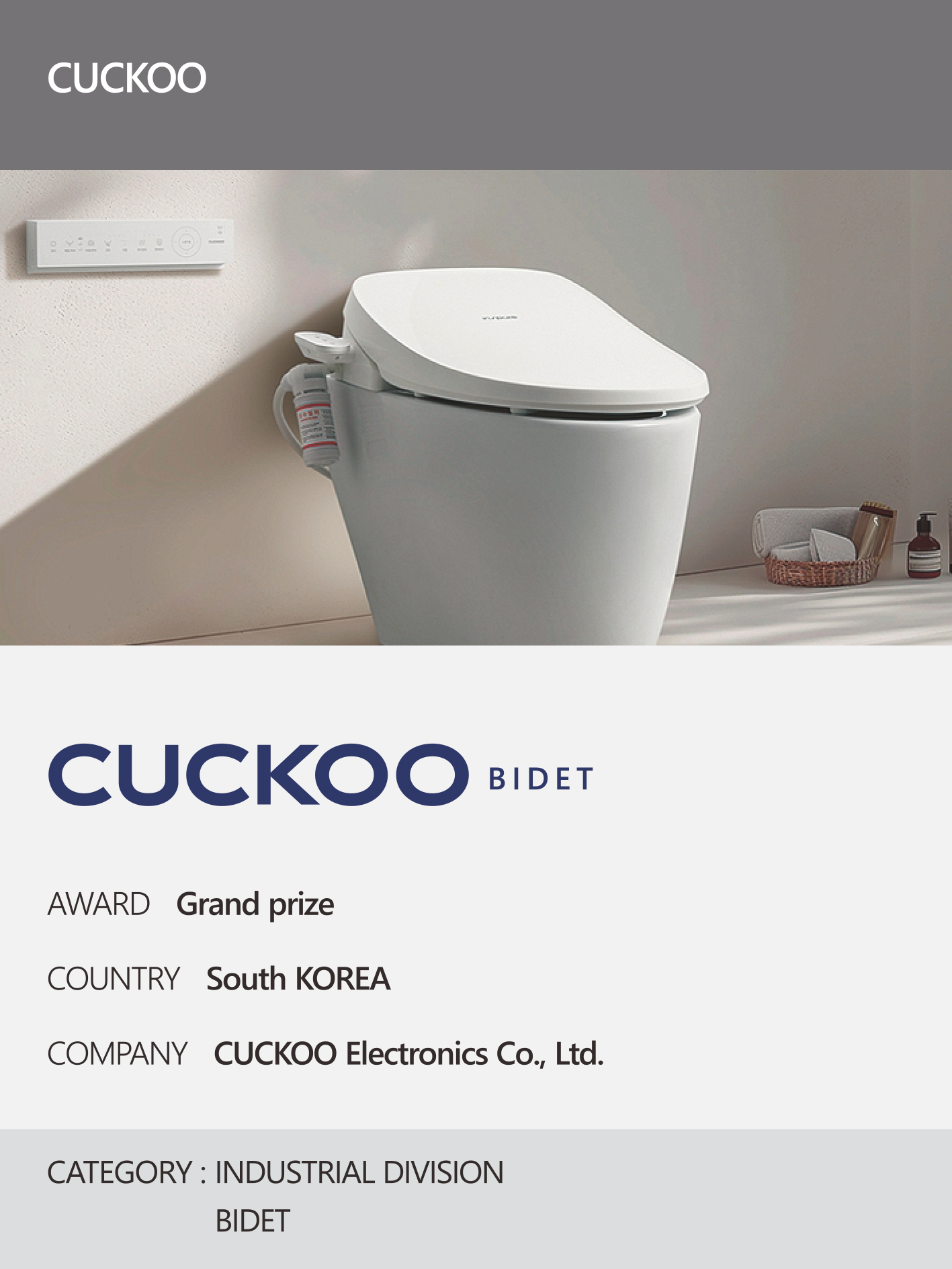 https://nyfknba.com/wp-content/uploads/2026/04/homepage_IL-19-1.jpg
1889
1417
nyfknba
https://nyfknba.com/wp-content/uploads/2025/11/nyf_logo1.svg
nyfknba2026-04-09 16:12:272026-04-10 14:57:44CUCKOO Ins Pure Bidet Interview 2026
https://nyfknba.com/wp-content/uploads/2026/04/homepage_IL-19-1.jpg
1889
1417
nyfknba
https://nyfknba.com/wp-content/uploads/2025/11/nyf_logo1.svg
nyfknba2026-04-09 16:12:272026-04-10 14:57:44CUCKOO Ins Pure Bidet Interview 2026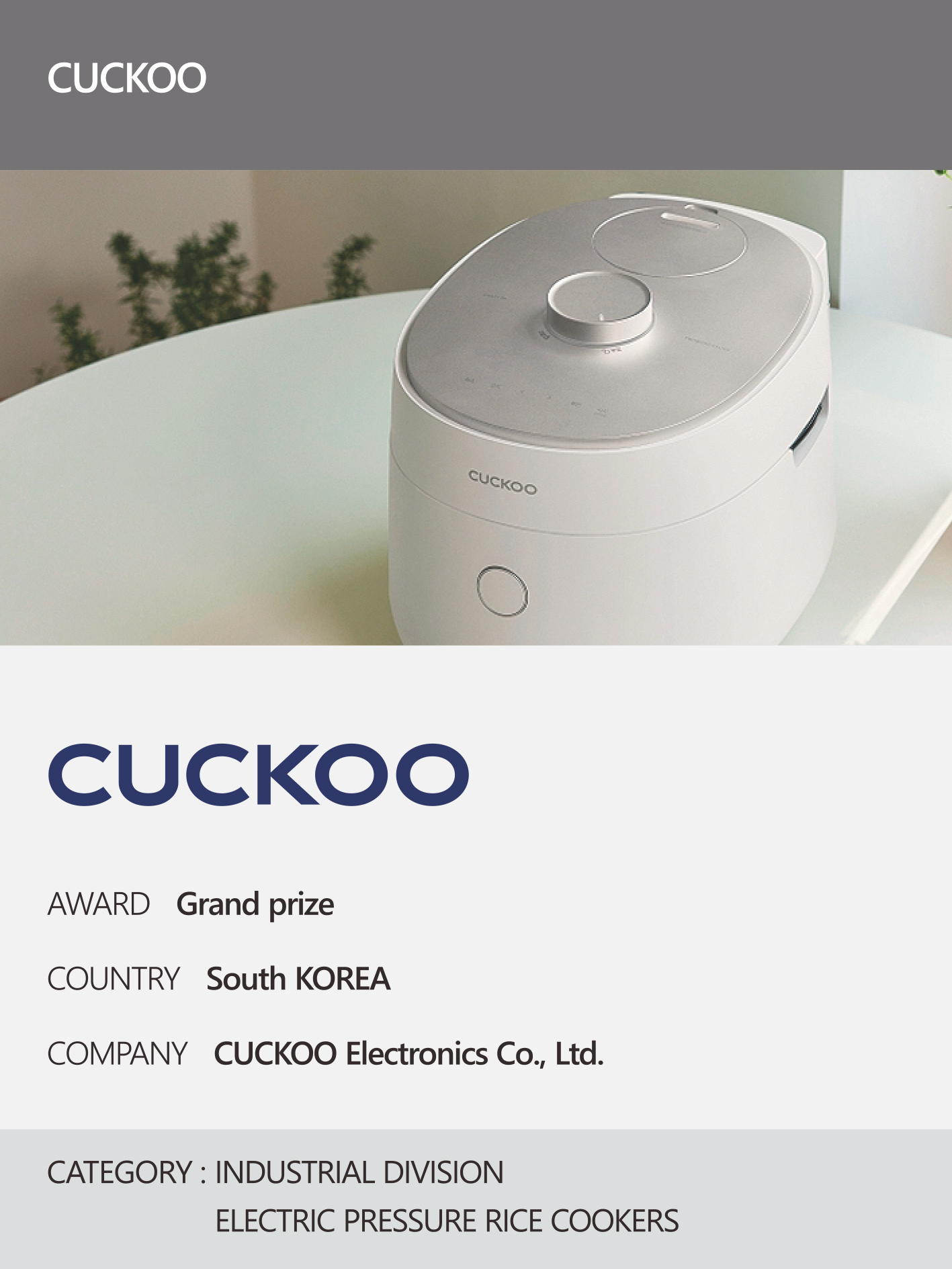 https://nyfknba.com/wp-content/uploads/2026/04/homepage_IL-18-1.jpg
1889
1417
nyfknba
https://nyfknba.com/wp-content/uploads/2025/11/nyf_logo1.svg
nyfknba2026-04-09 16:06:312026-04-10 14:53:52CUCKOO Interview 2026
https://nyfknba.com/wp-content/uploads/2026/04/homepage_IL-18-1.jpg
1889
1417
nyfknba
https://nyfknba.com/wp-content/uploads/2025/11/nyf_logo1.svg
nyfknba2026-04-09 16:06:312026-04-10 14:53:52CUCKOO Interview 2026 https://nyfknba.com/wp-content/uploads/2026/04/homepage_IL-17-1.jpg
1889
1417
nyfknba
https://nyfknba.com/wp-content/uploads/2025/11/nyf_logo1.svg
nyfknba2026-04-09 16:01:322026-04-09 16:03:50LG ELECTRONICS Interview 2026
https://nyfknba.com/wp-content/uploads/2026/04/homepage_IL-17-1.jpg
1889
1417
nyfknba
https://nyfknba.com/wp-content/uploads/2025/11/nyf_logo1.svg
nyfknba2026-04-09 16:01:322026-04-09 16:03:50LG ELECTRONICS Interview 2026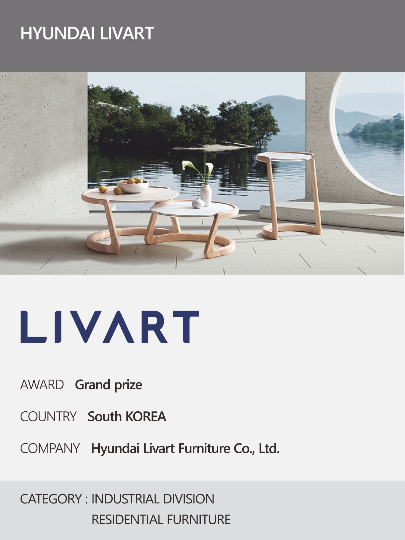 https://nyfknba.com/wp-content/uploads/2026/04/homepage_IL-16-1.jpg
1889
1417
nyfknba
https://nyfknba.com/wp-content/uploads/2025/11/nyf_logo1.svg
nyfknba2026-04-09 15:58:412026-04-09 15:59:00HYUNDAI LIVART Interview 2026
https://nyfknba.com/wp-content/uploads/2026/04/homepage_IL-16-1.jpg
1889
1417
nyfknba
https://nyfknba.com/wp-content/uploads/2025/11/nyf_logo1.svg
nyfknba2026-04-09 15:58:412026-04-09 15:59:00HYUNDAI LIVART Interview 2026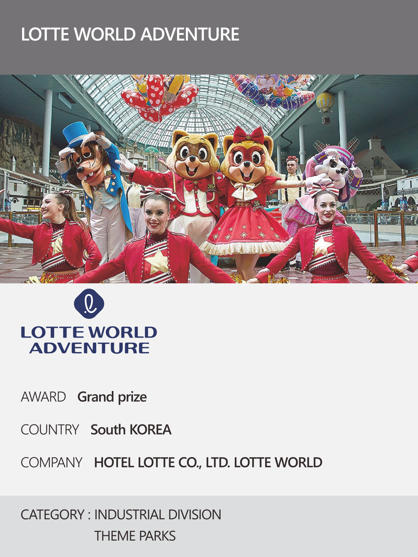 https://nyfknba.com/wp-content/uploads/2026/04/homepage_IL-15-1.jpg
1889
1417
nyfknba
https://nyfknba.com/wp-content/uploads/2025/11/nyf_logo1.svg
nyfknba2026-04-09 15:55:452026-04-09 15:56:19LOTTE WORLD ADVENTURE Interview 2026
https://nyfknba.com/wp-content/uploads/2026/04/homepage_IL-15-1.jpg
1889
1417
nyfknba
https://nyfknba.com/wp-content/uploads/2025/11/nyf_logo1.svg
nyfknba2026-04-09 15:55:452026-04-09 15:56:19LOTTE WORLD ADVENTURE Interview 2026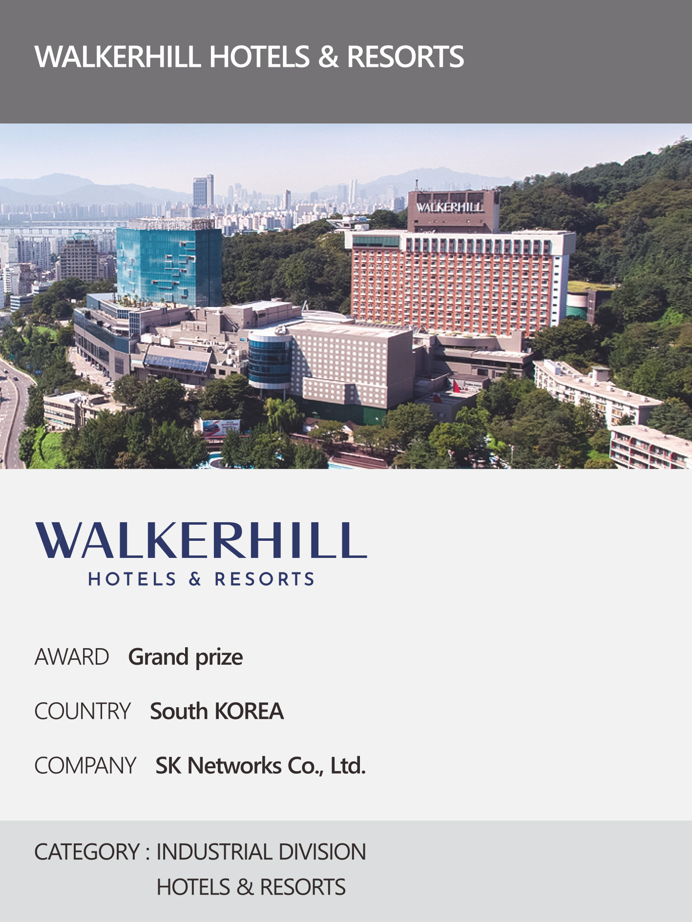 https://nyfknba.com/wp-content/uploads/2026/04/homepage_IL-14-1.jpg
1889
1417
nyfknba
https://nyfknba.com/wp-content/uploads/2025/11/nyf_logo1.svg
nyfknba2026-04-09 15:49:102026-04-09 15:50:43WALKERHILL HOTELS & RESORTS Interview 2026
https://nyfknba.com/wp-content/uploads/2026/04/homepage_IL-14-1.jpg
1889
1417
nyfknba
https://nyfknba.com/wp-content/uploads/2025/11/nyf_logo1.svg
nyfknba2026-04-09 15:49:102026-04-09 15:50:43WALKERHILL HOTELS & RESORTS Interview 2026 https://nyfknba.com/wp-content/uploads/2026/04/homepage_IL-13-1.jpg
1889
1417
nyfknba
https://nyfknba.com/wp-content/uploads/2025/11/nyf_logo1.svg
nyfknba2026-04-09 15:38:302026-04-09 15:45:11LG UPLUS HOME SERVICE Interview 2026
https://nyfknba.com/wp-content/uploads/2026/04/homepage_IL-13-1.jpg
1889
1417
nyfknba
https://nyfknba.com/wp-content/uploads/2025/11/nyf_logo1.svg
nyfknba2026-04-09 15:38:302026-04-09 15:45:11LG UPLUS HOME SERVICE Interview 2026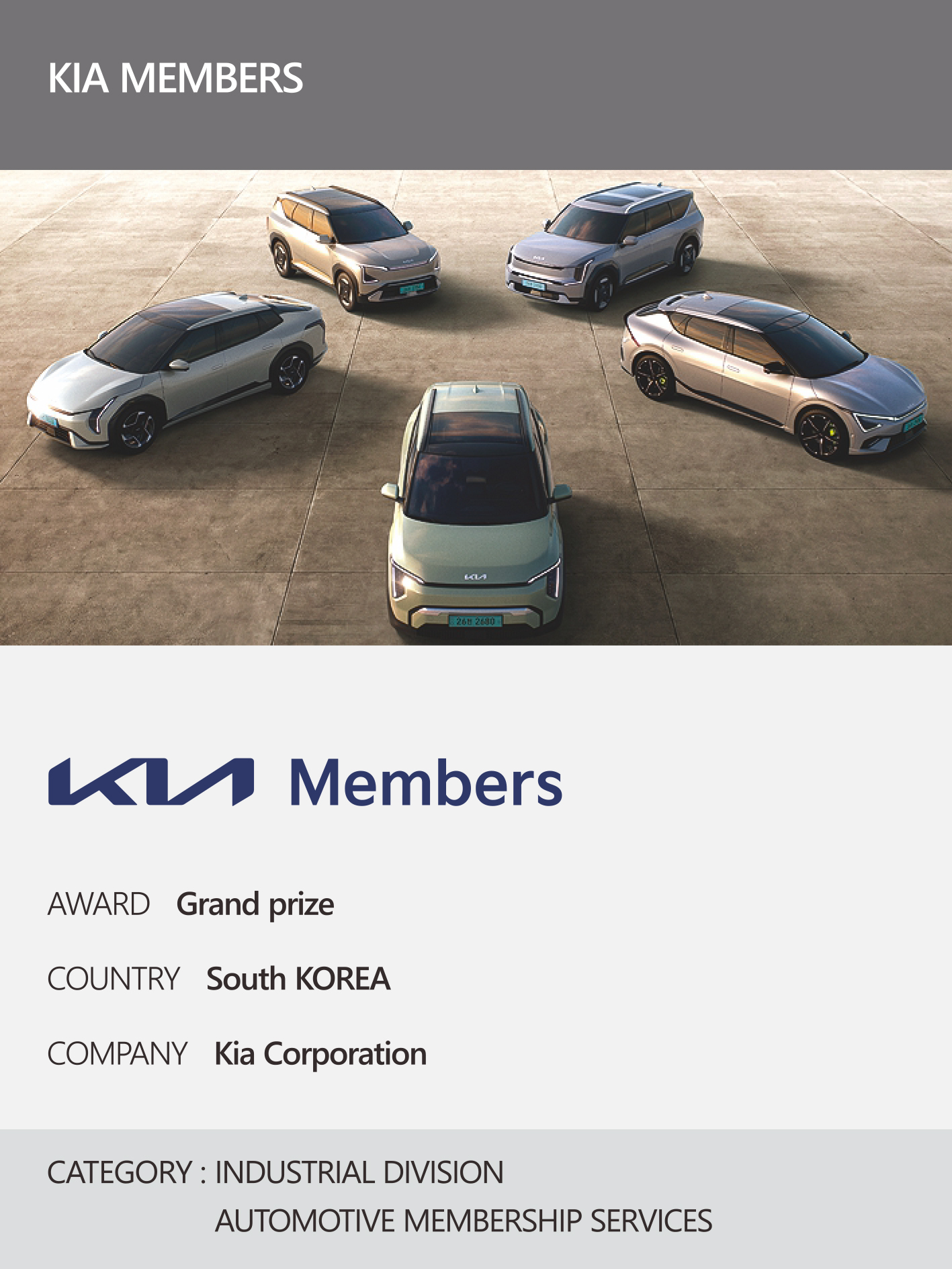 https://nyfknba.com/wp-content/uploads/2026/04/homepage_IL-12-1.jpg
1889
1417
nyfknba
https://nyfknba.com/wp-content/uploads/2025/11/nyf_logo1.svg
nyfknba2026-04-09 15:35:052026-04-09 15:44:54KIA MEMBERS Interview 2026
https://nyfknba.com/wp-content/uploads/2026/04/homepage_IL-12-1.jpg
1889
1417
nyfknba
https://nyfknba.com/wp-content/uploads/2025/11/nyf_logo1.svg
nyfknba2026-04-09 15:35:052026-04-09 15:44:54KIA MEMBERS Interview 2026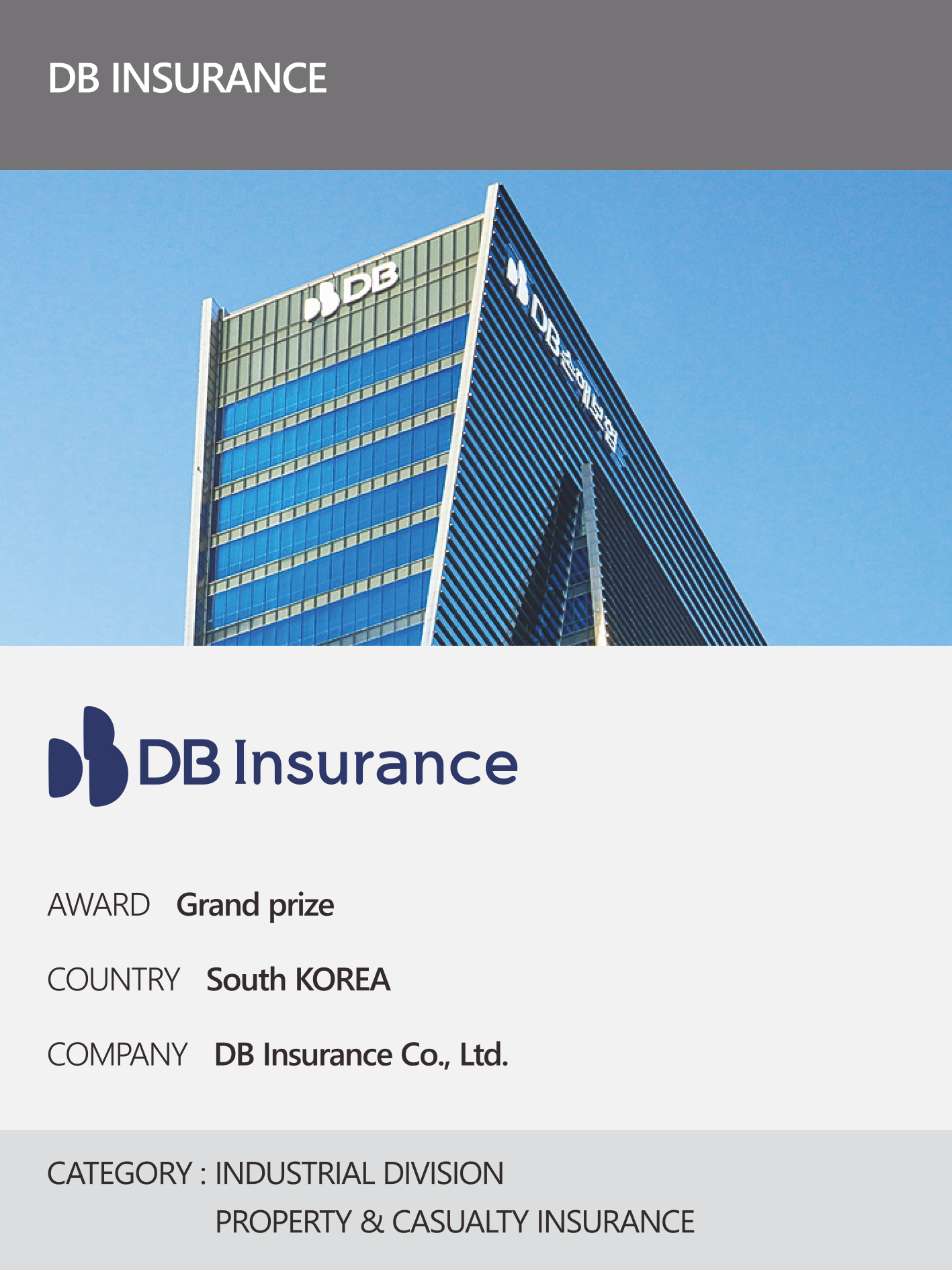 https://nyfknba.com/wp-content/uploads/2026/04/homepage_IL-11-1.jpg
1889
1417
nyfknba
https://nyfknba.com/wp-content/uploads/2025/11/nyf_logo1.svg
nyfknba2026-04-09 15:31:502026-04-09 15:44:33DB INSURANCE Interview 2026
https://nyfknba.com/wp-content/uploads/2026/04/homepage_IL-11-1.jpg
1889
1417
nyfknba
https://nyfknba.com/wp-content/uploads/2025/11/nyf_logo1.svg
nyfknba2026-04-09 15:31:502026-04-09 15:44:33DB INSURANCE Interview 2026 https://nyfknba.com/wp-content/uploads/2026/04/homepage_IL-10-1.jpg
1889
1417
nyfknba
https://nyfknba.com/wp-content/uploads/2025/11/nyf_logo1.svg
nyfknba2026-04-09 15:27:312026-04-09 15:44:16NH INVESTMENT & SECURITIES Interview 2026
https://nyfknba.com/wp-content/uploads/2026/04/homepage_IL-10-1.jpg
1889
1417
nyfknba
https://nyfknba.com/wp-content/uploads/2025/11/nyf_logo1.svg
nyfknba2026-04-09 15:27:312026-04-09 15:44:16NH INVESTMENT & SECURITIES Interview 2026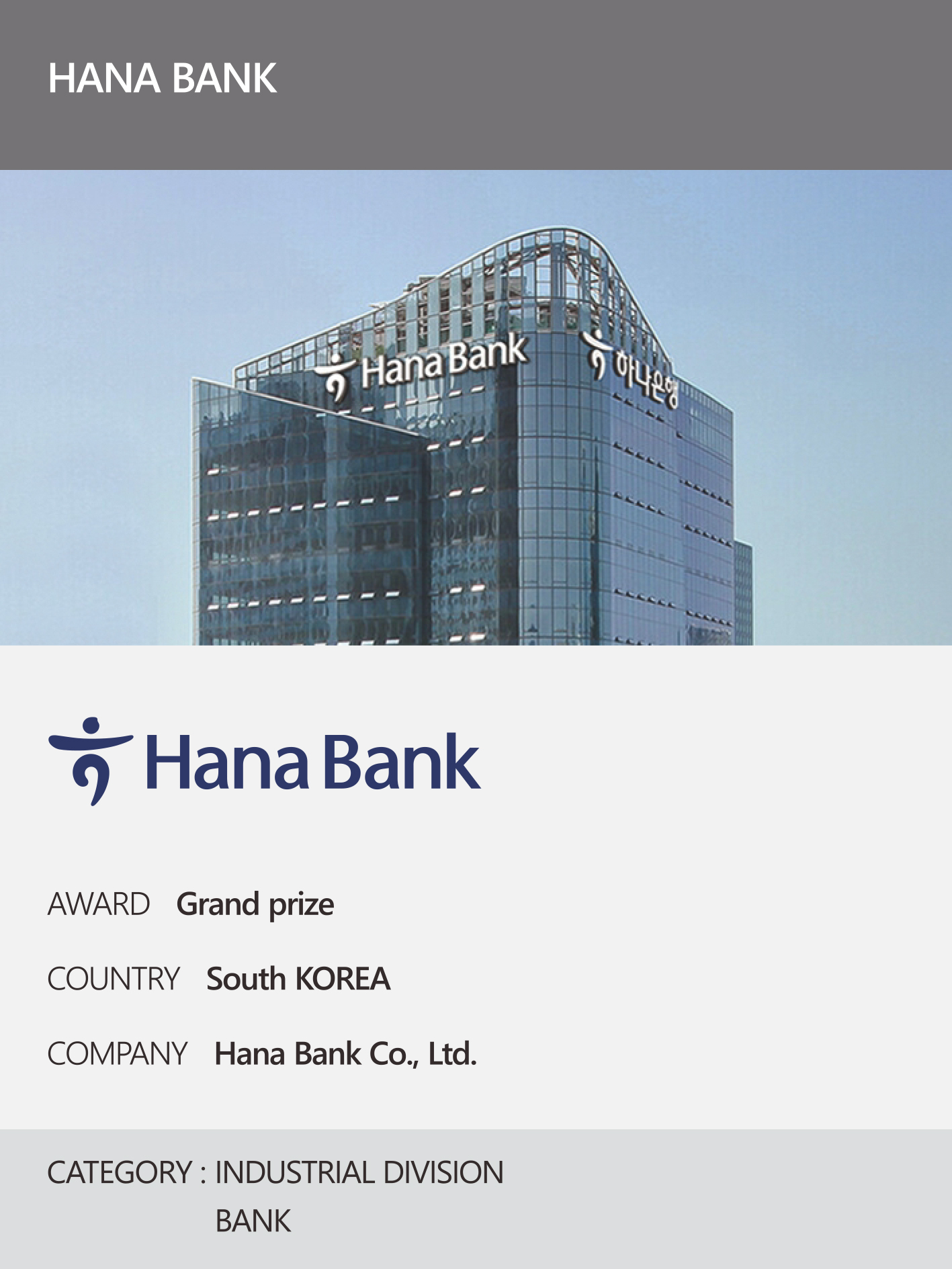 https://nyfknba.com/wp-content/uploads/2026/04/homepage_IL-9-1.jpg
1889
1417
nyfknba
https://nyfknba.com/wp-content/uploads/2025/11/nyf_logo1.svg
nyfknba2026-04-09 15:23:172026-04-09 15:44:02HANA BANK Interview 2026
https://nyfknba.com/wp-content/uploads/2026/04/homepage_IL-9-1.jpg
1889
1417
nyfknba
https://nyfknba.com/wp-content/uploads/2025/11/nyf_logo1.svg
nyfknba2026-04-09 15:23:172026-04-09 15:44:02HANA BANK Interview 2026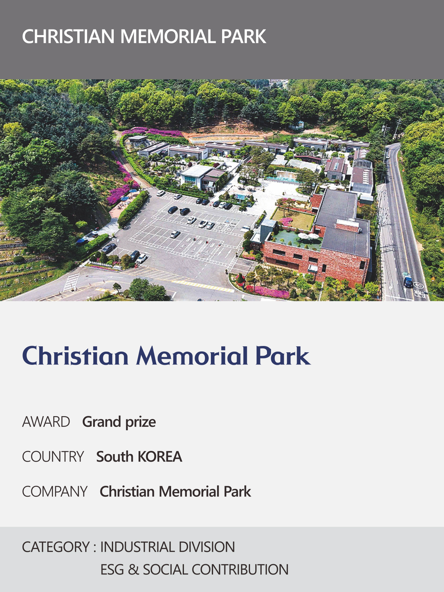 https://nyfknba.com/wp-content/uploads/2026/04/homepage_IL-8-1.jpg
1889
1417
nyfknba
https://nyfknba.com/wp-content/uploads/2025/11/nyf_logo1.svg
nyfknba2026-04-09 15:19:222026-04-09 15:43:43CHRISTIAN MEMORIAL PARK Interview 2026
https://nyfknba.com/wp-content/uploads/2026/04/homepage_IL-8-1.jpg
1889
1417
nyfknba
https://nyfknba.com/wp-content/uploads/2025/11/nyf_logo1.svg
nyfknba2026-04-09 15:19:222026-04-09 15:43:43CHRISTIAN MEMORIAL PARK Interview 2026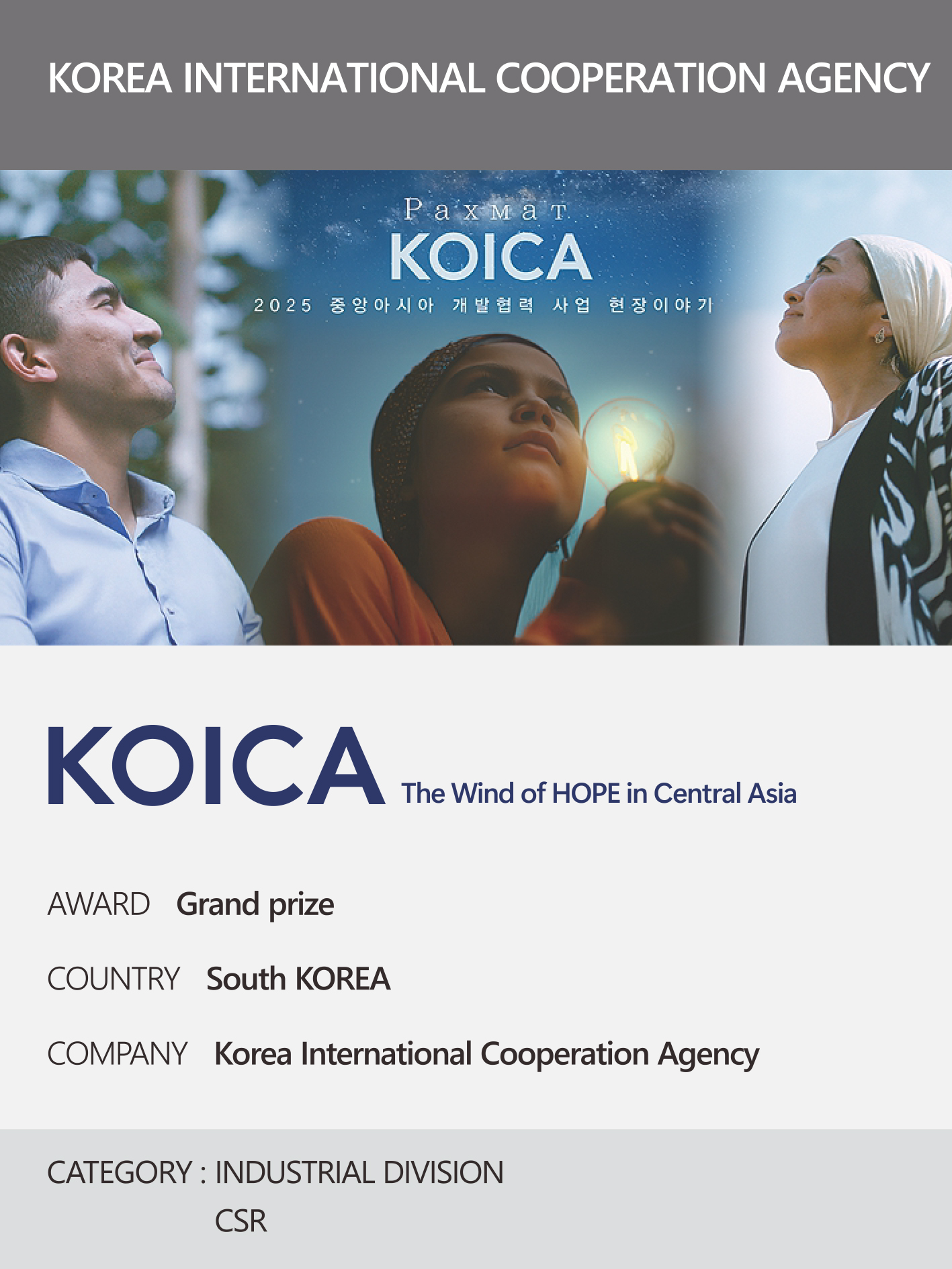 https://nyfknba.com/wp-content/uploads/2026/04/homepage_IL-7-1.jpg
1889
1417
nyfknba
https://nyfknba.com/wp-content/uploads/2025/11/nyf_logo1.svg
nyfknba2026-04-09 15:16:132026-04-09 15:43:23KOREA INTERNATIONAL COOPERATION AGENCY Interview 2026
https://nyfknba.com/wp-content/uploads/2026/04/homepage_IL-7-1.jpg
1889
1417
nyfknba
https://nyfknba.com/wp-content/uploads/2025/11/nyf_logo1.svg
nyfknba2026-04-09 15:16:132026-04-09 15:43:23KOREA INTERNATIONAL COOPERATION AGENCY Interview 2026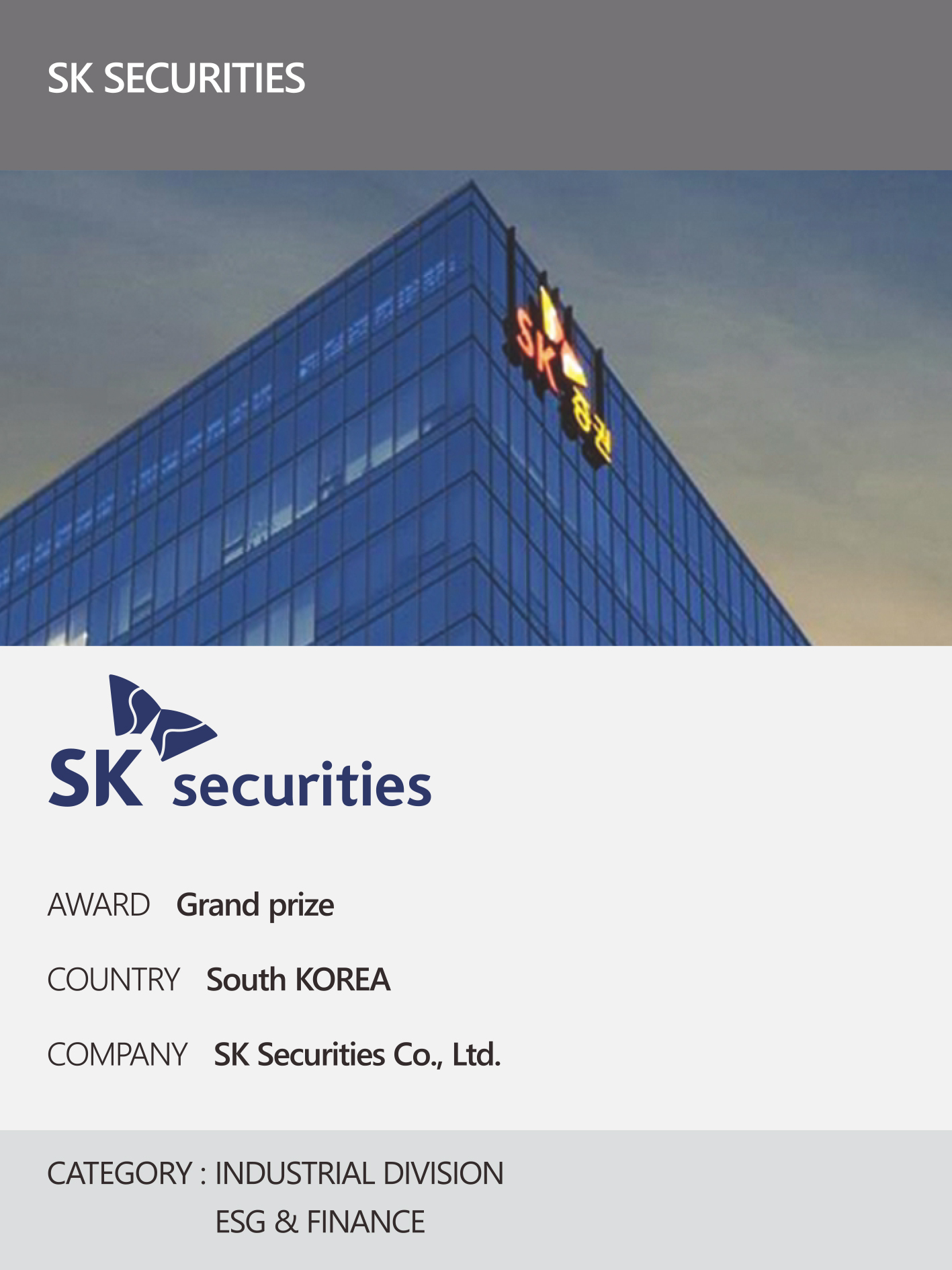 https://nyfknba.com/wp-content/uploads/2026/04/homepage_IL-6-1.jpg
1889
1417
nyfknba
https://nyfknba.com/wp-content/uploads/2025/11/nyf_logo1.svg
nyfknba2026-04-09 15:12:402026-04-09 15:42:55SK SECURITIES Interview 2026
https://nyfknba.com/wp-content/uploads/2026/04/homepage_IL-6-1.jpg
1889
1417
nyfknba
https://nyfknba.com/wp-content/uploads/2025/11/nyf_logo1.svg
nyfknba2026-04-09 15:12:402026-04-09 15:42:55SK SECURITIES Interview 2026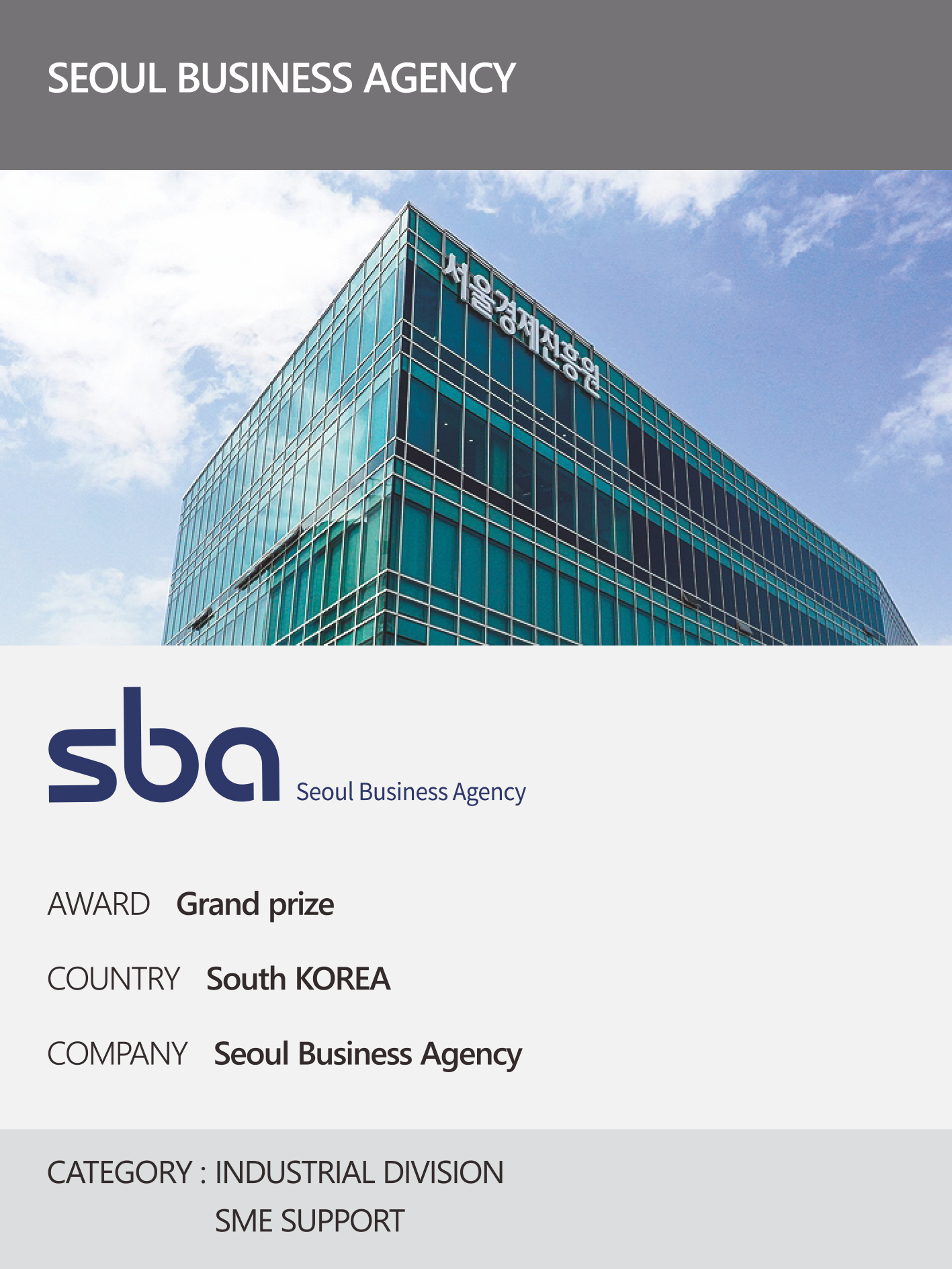 https://nyfknba.com/wp-content/uploads/2026/04/homepage_IL-5-1.jpg
1889
1417
nyfknba
https://nyfknba.com/wp-content/uploads/2025/11/nyf_logo1.svg
nyfknba2026-04-09 15:08:382026-04-09 15:42:23SBA Interview 2026
https://nyfknba.com/wp-content/uploads/2026/04/homepage_IL-5-1.jpg
1889
1417
nyfknba
https://nyfknba.com/wp-content/uploads/2025/11/nyf_logo1.svg
nyfknba2026-04-09 15:08:382026-04-09 15:42:23SBA Interview 2026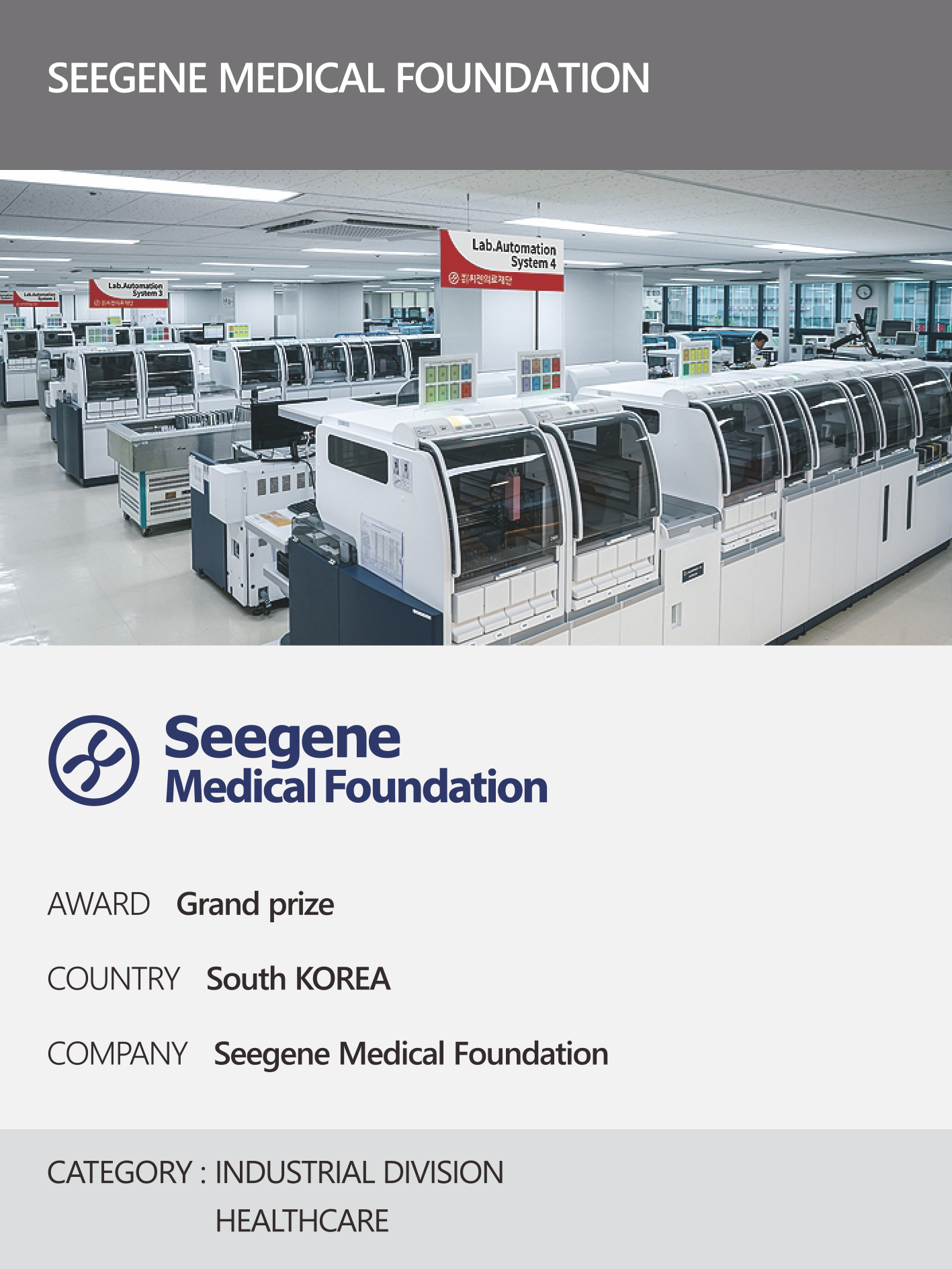 https://nyfknba.com/wp-content/uploads/2026/04/homepage_IL-4-1.jpg
1889
1417
nyfknba
https://nyfknba.com/wp-content/uploads/2025/11/nyf_logo1.svg
nyfknba2026-04-09 15:04:382026-04-09 15:41:56Seegene Medical Foundation Interview 2026
https://nyfknba.com/wp-content/uploads/2026/04/homepage_IL-4-1.jpg
1889
1417
nyfknba
https://nyfknba.com/wp-content/uploads/2025/11/nyf_logo1.svg
nyfknba2026-04-09 15:04:382026-04-09 15:41:56Seegene Medical Foundation Interview 2026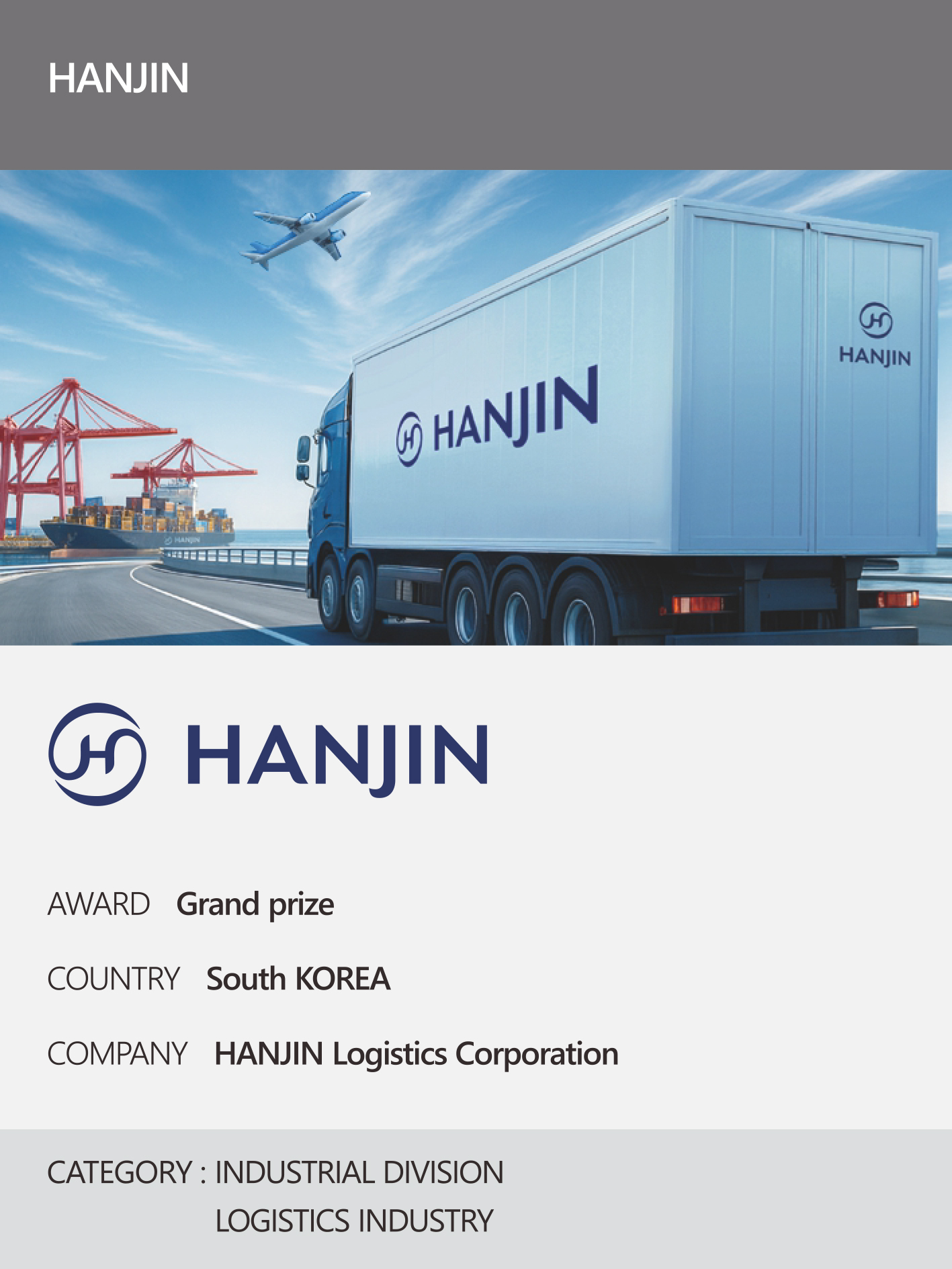 https://nyfknba.com/wp-content/uploads/2026/04/homepage_IL-3-1.jpg
1889
1417
nyfknba
https://nyfknba.com/wp-content/uploads/2025/11/nyf_logo1.svg
nyfknba2026-04-09 14:58:152026-04-09 15:41:12HANJIN Interview 2026
https://nyfknba.com/wp-content/uploads/2026/04/homepage_IL-3-1.jpg
1889
1417
nyfknba
https://nyfknba.com/wp-content/uploads/2025/11/nyf_logo1.svg
nyfknba2026-04-09 14:58:152026-04-09 15:41:12HANJIN Interview 2026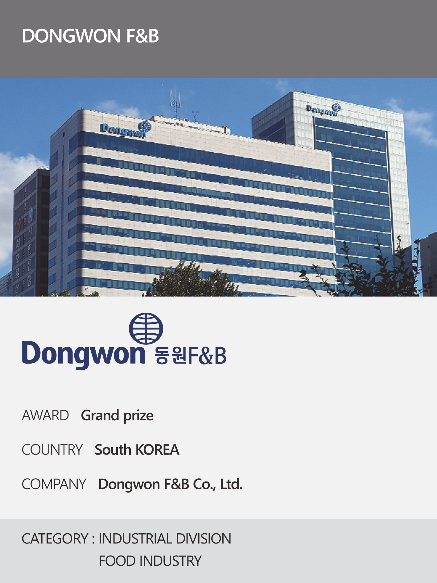 https://nyfknba.com/wp-content/uploads/2026/04/homepage_IL-2-1.jpg
1889
1417
nyfknba
https://nyfknba.com/wp-content/uploads/2025/11/nyf_logo1.svg
nyfknba2026-04-09 14:52:082026-04-09 14:54:11DONGWON F&B Interview 2026
https://nyfknba.com/wp-content/uploads/2026/04/homepage_IL-2-1.jpg
1889
1417
nyfknba
https://nyfknba.com/wp-content/uploads/2025/11/nyf_logo1.svg
nyfknba2026-04-09 14:52:082026-04-09 14:54:11DONGWON F&B Interview 2026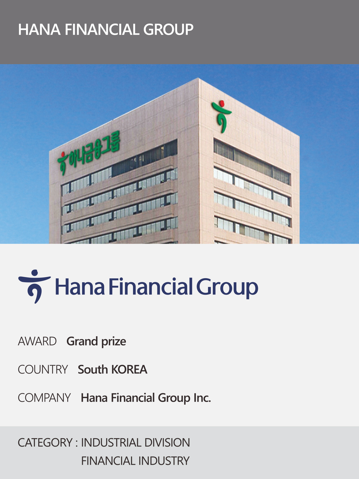 https://nyfknba.com/wp-content/uploads/2026/04/homepage_IL-1-1.jpg
1889
1417
nyfknba
https://nyfknba.com/wp-content/uploads/2025/11/nyf_logo1.svg
nyfknba2026-04-09 14:44:532026-04-09 14:54:26Hana Financial Group Interview 2026CHEONGJU, BUSINESS-FRIENDLY CITY Interview 2026
https://nyfknba.com/wp-content/uploads/2026/04/homepage_IL-1-1.jpg
1889
1417
nyfknba
https://nyfknba.com/wp-content/uploads/2025/11/nyf_logo1.svg
nyfknba2026-04-09 14:44:532026-04-09 14:54:26Hana Financial Group Interview 2026CHEONGJU, BUSINESS-FRIENDLY CITY Interview 2026